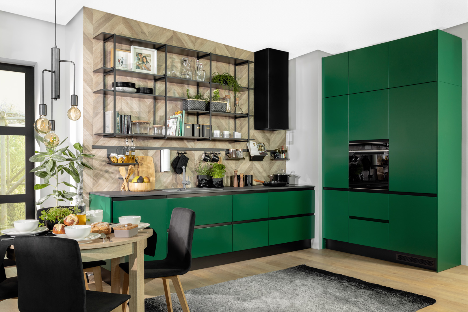
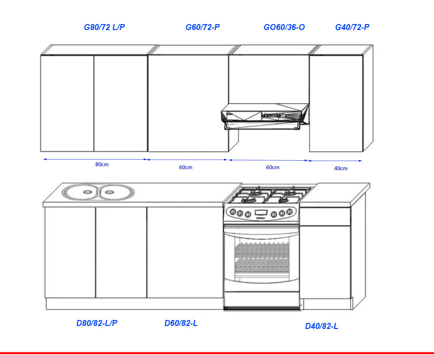
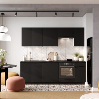
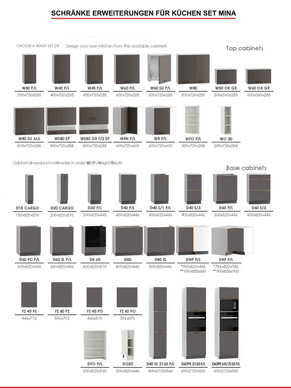
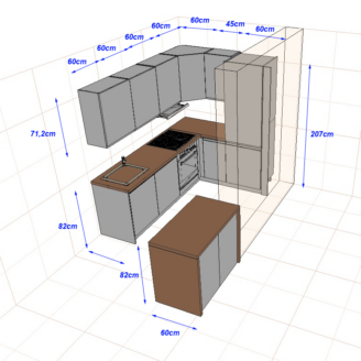
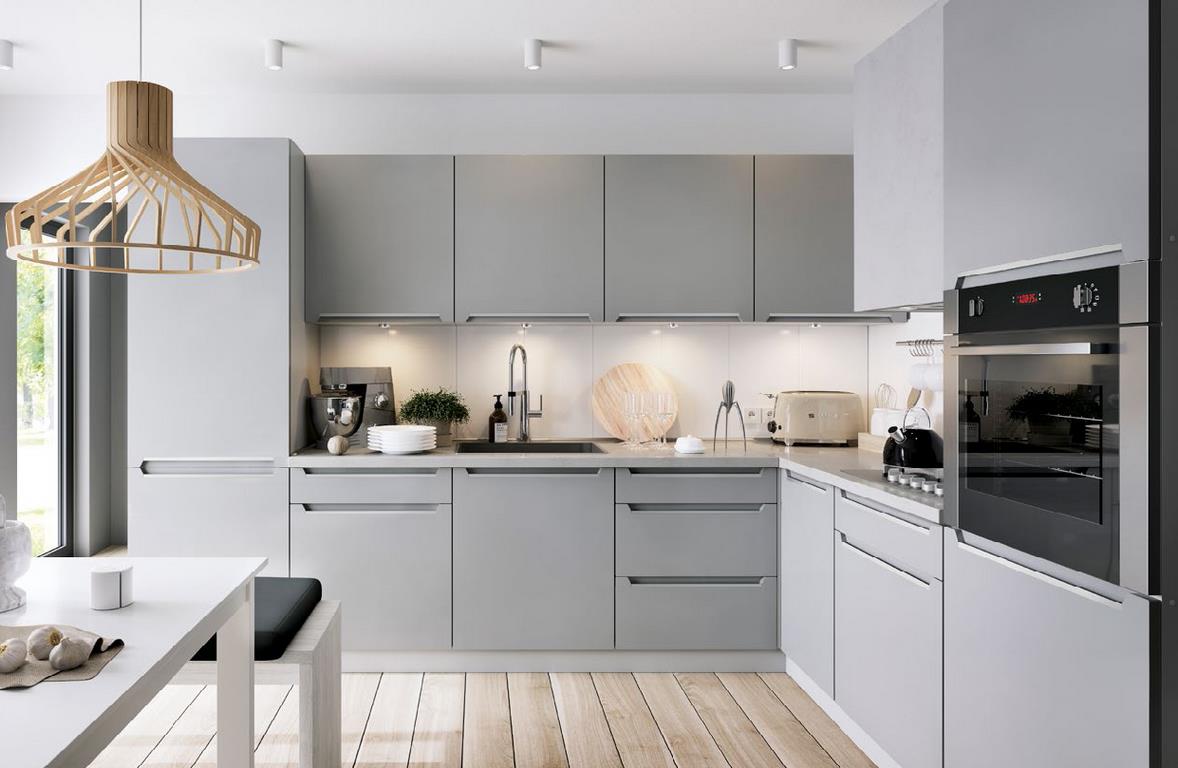
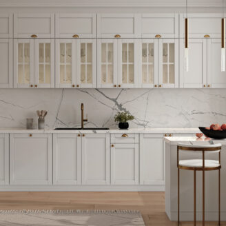
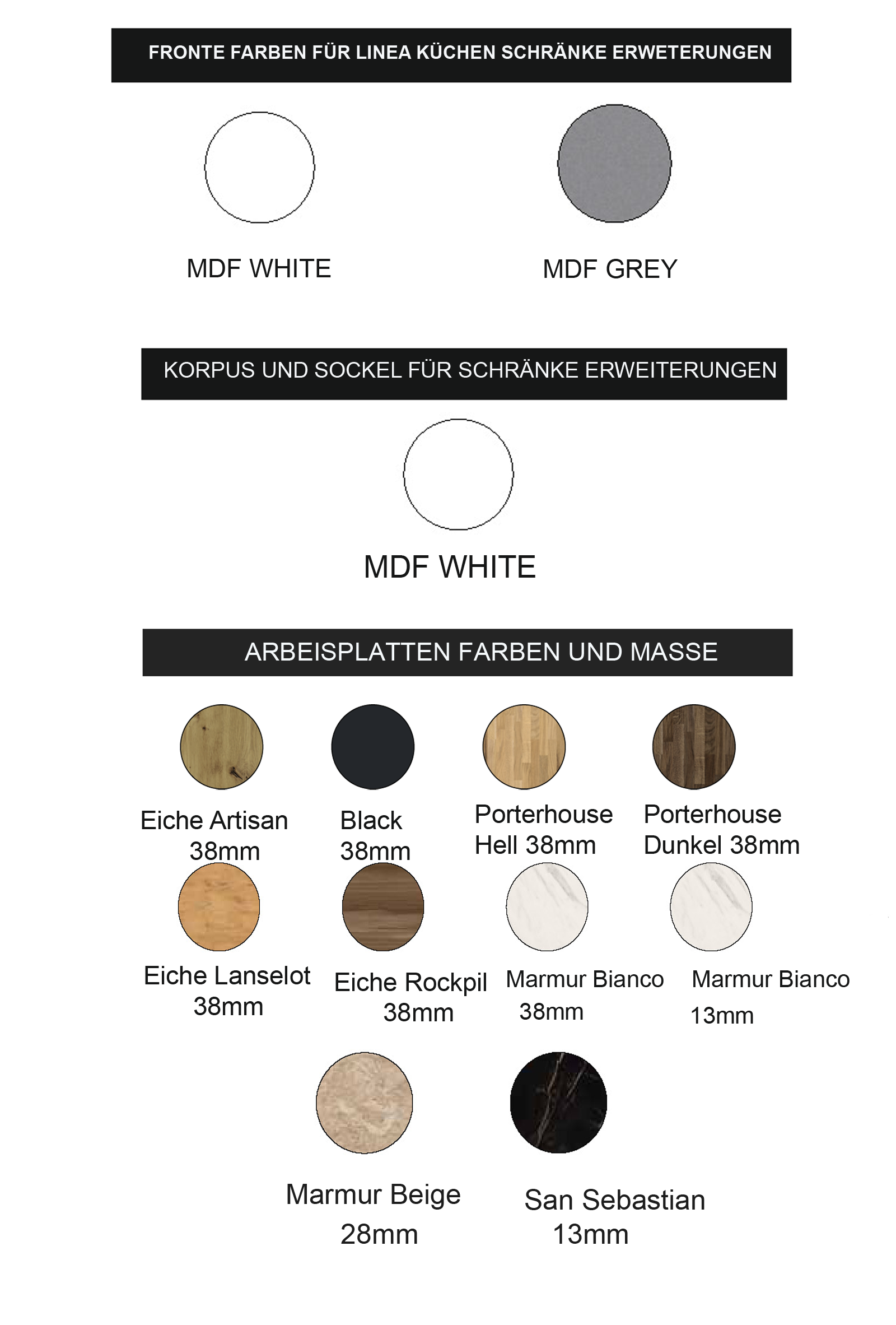
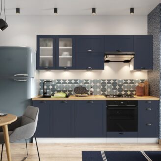
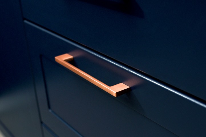
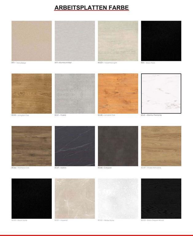
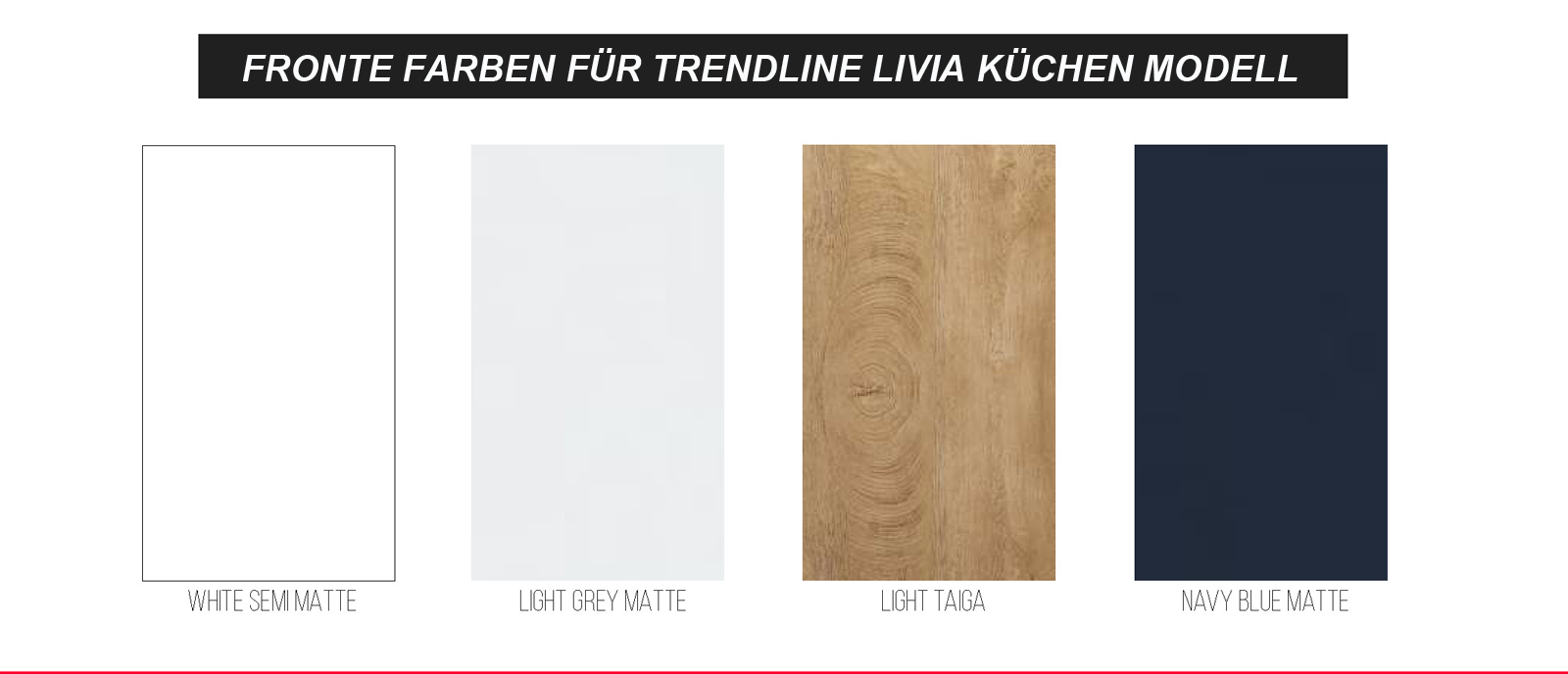
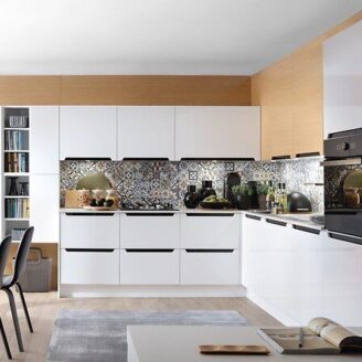
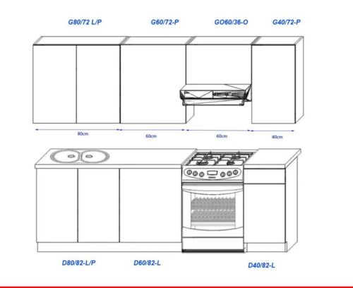
Beschreibung
body { -moz-osx-font-smoothing: grayscale; -webkit-font-smoothing: antialiased; } .pagewidth { max-width:1200pix; margin:0 auto; } *:focus { outline: 0; } .clearer::after { content: “”; display: table; clear: both; } .block { display:block !important; } .inline { display:inline !important; } .inline-block { display:inline-block !important; } .hide-mobile { display:block; } a { color:#666; } a:link { color:#666; } a:visited { color:#666; } hr { color:#ccc; height:1px; background:#ccc; border:none; } h1 { position:relative; border-bottom: 1px solid #ccc; color: #666; font-weight: 300; margin: 0 0 1em; padding: 10px 0; text-transform: uppercase; } h1::before { border-bottom: 1px solid #666; bottom: -1px; content: “”; position: absolute; width: 20%; } h2 { border-bottom: 1px solid #bbb; color: #666; display: block; font-size: 20px; font-weight: 300; padding: 10px 0; margin:1em 0; } .star-image { display: grid; } h3 { font-weight: bold; text-transform: uppercase; } @media screen and (max-width : 760px){ h2 { text:center; border-top:1px solid #bbb; padding: 10px 0 !important; margin:2em 0 1em !important; } h1 { text:center; } h1::before { display:none; } .tabs { margin-bottom:0 !important; } } #show-mobile { display:none; } #cross-selling { display:block; width:100%; } #cross-selling > div#boxwrapper { display:block !important; width:100%; } #cross-selling > div#infowrapper { display:block !important; width:100%; } .crossitem { background: #fff none repeat scroll 0 0; min-height: 420px; padding: 10px 10px 25px; text: center; transition: all 0.3s ease-in-out 0s; border: 1px solid #ccc; } .crossitem:hover { transform: scale(1.03) rotate(1.5deg); box-shadow: 0px 0px 7px #aaa; border-color: #aaa; } .crossitem a { display:block; text-decoration:none; outline:none; } .crossitem a:visited { color:#666; } .artikelname { font-weight: normal; font-size: 16px; padding:1em 0; color:#666; } .preis { font-weight: normal; font-size: 2.5em; color: #444; text-align: center; display: block; } #variation { border-top: 1px solid #ccc; font-family: sans-serif; margin: 15px 0 0; max-width: 100%; padding:15px 0; } .variation { list-style: outside none none; } .variation li { background-color: #555 !important; border: 0 !important; color: #fff !important; display: inline-block !important; font-size: 14px !important; padding: 10px 17px !important; margin: 5px 7px 5px 0 !important; } .variation li::before{ content:none !important; } @media only screen and (min-width: 1024px) { #leftcontent { min-height: 585px; } #cross-selling .boxcontainer { width:22.5%; margin:0 0.5%; float:left; display:inline-block; } #cross-selling > div#boxwrapper { display:block !important; width:100%; min-height:480px; padding:10px; } #cross-selling > div#infowrapper { display:block !important; width:100%; min-height:300px; margin-top:3em; } } #maincontainer { display:block; width:100%; max-width:1200px; margin:0 auto; font: 14px “Open Sans”, sans-serif; color:#777; overflow-x:hidden; } #maincontainer ul, #maincontainer ul li { padding:0; margin:0; list-style-position: inside; } #headerlogo { width:25%; height:80px; float:left; display:inline-block; text:left; } #headertexte { color:#666; margin:0 auto; display:inline-block; } #headerlogo img { max-width:100%; max-height:80px; } #headerlogo a { display:block; height:80px; text-decoration:none; font-size:0px; position:relative; } #headerlogo a::after { content: ” “; position: absolute; top: 0; bottom: 0; width: 100%; display: block; } #headerinfo { width:24%; float:right; display:inline-block; padding-top:27px; } #headerinfo-1 { width:100%; float:left; display:inline-block; } #headerinfo-2 { width:100%; float:left; display:inline-block; } #topicon { color: #777; font-size: 32px; display:inline-block; margin:0 auto; text:center; margin-right:10px; } span.headertext-1 { display:block; color:#777; font-size:14px; } span.headertext-2 { display:block; color:#777; font-size:10px; } #boxwrapper { width:22.5%; display:inline-block; float:left; padding-right:2.5%; } #infowrapper { width:22.5%; display:inline-block; float:left; } #bottomcontent { width:100%; display:inline-block; float:left; } #leftcontent { width:52%; display:inline-block; float:left; padding-right:3%; } #rightcontent { width:45%; display:inline-block; float:left; } #topheader { width:100%; display:inline-block; float:left; } #topcontent { width:100%; display:inline-block; float:left; margin-bottom:2.5em; } #topnavi { width:100%; display:inline-block; float:left; clear:both; } div.boxcontainer { margin-bottom:20px; } div.boxcontainer::after { content: “”; display: table; height: 15px; } .boxtitle { background: #fff none repeat scroll 0 0; border-bottom: 1px solid #ccc; display: block; font-size: 16px; font-weight: bold; padding: 15px 0 10px; position: relative; text-transform: uppercase; margin:0 10px; } .boxtitle::before { border-bottom: 1px solid #666; bottom: -1px; content: “”; position: absolute; width: 30%; } .boxcontent { display:block; padding:20px 10px; font-size:13px; background:#fff; } .boxcontent img { display:inline-block; margin:0 auto; max-width:100%; } .versand ul li::before { content: “\\f0d1” !important; display: table; clear: both; font-family: FontAwesome; display: inline; color: #666; position: relative; margin-right:5px; } #footercontainer { width:94%; margin:0 auto; } div.footer { background:#393939; padding:20px 0 0; margin:20px 0 0 ; font-size:11px; color:#fff; text:center; border-radius:3px; } #bottomcontent ul, div.boxcontainer ul{ margin:10px 0; padding:0; } #bottomcontent ul li, div.boxcontainer ul li, #rightcontent ul li, #tabinhalt ul li { margin:0; padding:5px 0; border-top:1px solid #eee; list-style:none; } #bottomcontent ul li:last-child, div.boxcontainer ul li:last-child, #rightcontent ul li:last-child , #tabinhalt ul li:last-child { border-bottom:1px solid #eee; } #bottomcontent ul li::before, div.boxcontainer ul li::before, #rightcontent ul li::before { content: “\\f14a”; display: table; clear: both; font-family: FontAwesome; display: inline; color: #666; position: relative; margin-right:5px; } #tabinhalt ul li::before { content: “\\f138”; display: table; clear: both; font-family: FontAwesome; display: inline; color: #666; position: relative; margin-right:5px; } div.boxcontainer ul li { padding:5px 0 !important; } @media only screen and (max-width : 1200px) { #maincontainer { width:95%; } } @media only screen and (max-width : 1024px) { .hide-mobile { display:none !important; } #maincontainer { width:95%; } #headerlogo { width:30%; display:inline-block; float:left; text:left; } #headerlogo a { text:center; } #headerinfo { width:30%; display:block; padding:20px 0 0px 20px; display:block; margin:0 auto; } #headerinfo-1 { width:100%; display:inline-block; float:left; } #headerinfo-2 { width:100%; display:inline-block; float:left; } #maincontent > div#boxwrapper { display:none; } #maincontent > div#infowrapper { display:none; } #maincontent > div#bottomcontent { width:100%; } #show-mobile { display:block; width:100%; } #show-mobile > div#boxwrapper { display:block !important; width:100%; } #show-mobile > div#infowrapper { display:block !important; width:100%; } #cross-selling{ display:block; width:100%; } #cross-selling > div#boxwrapper { display:block !important; width:100%; } #cross-selling > div#infowrapper { display:block !important; width:100%; margin-top:3em; } div.boxcontainer { width:48%; margin:0 0.5%; float:left; display:inline-block; min-height:310px; } } @media only screen and (max-width : 700px) { div.boxcontainer { width:100%; margin:0; display:inline-block; } .crossitem:hover { cursor: pointer; transform: none !important; box-shadow: none !important; opacity: 1; border-color: #aaa; } } @media only screen and (max-width : 780px) { #header { text:center; } #headerlogo { width:100%; display:block; text:left; } #headerinfo { width:50%; display:block; padding:15px 0 10px; display:block; margin:0 auto; } #headerinfo-1 { width:100%; display:block; float:left; } #headerinfo-2 { width:100%; display:block; float:left; } #headerinfo-1::before, #headerinfo-2::before { display:block; padding-right: 190px; } } @media only screen and (max-width : 639px) { #leftcontent, #rightcontent { width:100%; } } @media only screen and (max-width : 499px) { #headerlogo { width:100%; display:block; text:left; } #headerinfo { width:100%; display:block; padding:15px 0 10px; display:block; margin:0 auto; } #headerinfo-1 { width:100%; display:block; float:left; } #headerinfo-2 { width:100%; display:block; float:left; } #maincontent > div#boxwrapper { display:none !important; } #maincontent > div#bottomcontent { width:100% !important; } #show-mobile { display:block; } #cross-selling { display:block; } #leftcontent, #rightcontent { width:100%; } .slider { display:none; } } /*Ab hier NEU*/ #header { margin-top:20px; } .badge { background-color: #666; color: #fff; text-shadow: none; border-radius: 15px; padding-left: 15px; padding-right: 15px; display: inline-block; font-size: 11.844px; vertical-align: baseline; white-space: nowrap; font-weight:bold; line-height:25px; top:25%; position:relative; letter-spacing:1.1; } /*Top Navigation*/ #navibadge{ display:block; float:right; height:50px; margin-right:1%; } #navicontainer { margin:5px 0 20px; display:block; background:#fff; border-top:1px solid #666; border-bottom:1px solid #666; height:50px; } #navicontainer::after { content: “”; display: table; width: 100%; height: 50px; } /*Strip the ul of padding and list styling*/ #navicontainer ul { list-style-type:none; margin:0; padding:0; position: absolute; } /*Create a horizontal list with spacing*/ #navicontainer li { display:inline-block; float: left; margin-right: 1px; } /*Style for menu links*/ #navicontainer li a { display:block; min-width:30px; height: 50px; text: center; line-height: 50px; font-family: “Helvetica Neue”, Helvetica, Arial, sans-serif; color: #666; background: #fff; text-decoration: none; text-transform:uppercase; font-size:14px; letter-spacing:0.07em; transition: all 0.5s ease 0s; padding:0 20px; } /*Hover state for top level links*/ #navicontainer li:hover a { background: #666; color:#fff; transition: all 0.5s ease 0s; } /*Style for dropdown links*/ #navicontainer li:hover ul a { background: #666; color: #fff; height: 40px; line-height: 40px; } /*Hover state for dropdown links*/ #navicontainer li:hover ul a:hover { background: #333; color: #fff; } /*Hide dropdown links until they are needed*/ #navicontainer li ul { display: none; } /*Make dropdown links vertical*/ #navicontainer li ul li { display: block; float: none; } /*Prevent text wrapping*/ #navicontainer li ul li a { width: auto; min-width: 100px; padding: 0 20px; } /*Display the dropdown on hover*/ #navicontainer ul li a:hover + .hidden, .hidden:hover { display: block !important; z-index:999999; } /*Style ‘show menu’ label button and hide it by default*/ .show-menu { font-family: “Helvetica Neue”, Helvetica, Arial, sans-serif; text-decoration: none; color: #fff; background: #666; text: center; padding: 10px 0; display: none; } /*Hide checkbox*/ input[type=checkbox]{ display: none; } /*Show menu when invisible checkbox is checked*/ input[type=checkbox]:checked ~ #menu{ display: block; } /*Responsive Styles*/ @media screen and (max-width : 1200px){ #navicontainer { background:transparent; height:2em; } /*Make dropdown links appear inline*/ #navicontainer ul { position: static; display: none; } /*Create vertical spacing*/ #navicontainer li { margin-bottom: 1px; } #navicontainer li a { border-bottom:1px solid #bbb; padding:0; } #navicontainer ul li:last-child a { margin-bottom:1em; } /*Make all menu links full width*/ #navicontainer ul li, li a { width: 100%; } /*Display ‘show menu’ link*/ .show-menu { display:block; cursor:pointer; } .show-menu::before { content: “\\f039″; display: table; clear: both; font-family: FontAwesome; display: inline; color: #fff; position: relative; margin-right: 15px; } } @media screen and (max-width : 1200px){ #navibadge{ display:none; } } /*Ab hier Slider*/ .slider { padding: 0; margin: 0; max-width: 99%; margin: 0 auto; overflow: hidden; border-radius: 3px; margin-bottom:1em; box-shadow:0px 0px 5px #888; } .slider ul { width: 1000%; height: auto; position: relative; list-style: none; left: 0; margin: 0; padding: 0; line-height: 0; -moz-animation:slide-animation 20s infinite; -webkit-animation:slide-animation 20s infinite; } .slider ul:hover { -moz-animation-play-state:paused; -webkit-animation-play-state:paused; } .slider li { width: 10%; list-style: none; float: left; margin: 0; padding: 0; } img { max-width: 100%; } @-webkit-keyframes slide-animation { 1% { left: 0%; opacity: 1; } 18% { left: 0%; opacity: 1} 19% { opacity: 0.2; } 20% { left: -100%; opacity: 1; } 58% { left: -100%; opacity: 1; } 59% { opacity: 0.2; } 60% { left: -200%; opacity: 1; } 98% { left: -200%; opacity: 1; } 99% { opacity: 0.5; } 100% { left: 0%; } } @-moz-keyframes slide-animation { 1% { left: 0%; opacity: 1; } 18% { left: 0%; opacity: 1} 19% { opacity: 0.2; } 20% { left: -100%; opacity: 1; } 58% { left: -100%; opacity: 1; } 59% { opacity: 0.2; } 60% { left: -200%; opacity: 1; } 98% { left: -200%; opacity: 1; } 99% { opacity: 0.5; } 100% { left: 0%; } } /*Tabs*/ .tabs { max-width: 100%; float: none; list-style: none; padding: 0; margin: 0 auto 2em; } .tabs::after { content: ”; display: table; clear: both; } #tab-content2, #tab-content3 { display: none; } .tabs input[type=”radio”] { display:none; } .tabs label { display: block; float: left; width: 33.3333%; color: #ccc; font-size: 23px; font-weight: 100; text-decoration: none; text: center; line-height: 2; cursor: pointer; box-shadow: inset 0 1px #ccc; border-bottom: 1px solid #ccc; -webkit-transition: all 0.5s; /* Safari 3.1 to 6.0 */ transition: all 0.5s; letter-spacing:0.05em; } .tabs label span { display: none; } .tabs label i { padding: 5px; margin-right: 0; } .tabs label:hover { color: #666; box-shadow: inset 0 1px #666; border-bottom: 1px solid #666; } .tabcontent { width: 100%; float: left; padding: 15px; box-sizing: border-box; background-color:transparent; } #tab1:checked + label, #tab2:checked + label, #tab3:checked + label { background: transperent; box-shadow: inset 0 1px #666; border-bottom: 1px solid #666; color: #666; } #tab1:checked ~ #tab-content1 { display: block; } #tab1:checked ~ #tab-content2, #tab1:checked ~ #tab-content3 { display: none; } #tab2:checked ~ #tab-content2 { display: block; } #tab2:checked ~ #tab-content1, #tab2:checked ~ #tab-content3 { display: none; } #tab3:checked ~ #tab-content3 { display: block; } #tab3:checked ~ #tab-content1, #tab3:checked ~ #tab-content2 { display: none; } #tab5:checked + label, #tab6:checked + label, #tab7:checked + label { background: transperent; box-shadow: inset 0 1px #666; border-bottom: 1px solid #666; color: #666; } #tab5:checked ~ #tab-content5 { display: block; } #tab5:checked ~ #tab-content6, #tab5:checked ~ #tab-content7 { display: none; } #tab6:checked ~ #tab-content6 { display: block; } #tab6:checked ~ #tab-content5, #tab6:checked ~ #tab-content7 { display: none; } #tab7:checked ~ #tab-content7 { display: block; } #tab7:checked ~ #tab-content5, #tab7:checked ~ #tab-content5 { display: none; } .animiert { animation-duration: 1s; animation-fill-mode: both; } @keyframes scale { 0% { transform: scale(0.9); opacity: 0; } 50% { transform: scale(1.01); opacity: 0.5; } 100% { transform: scale(1); opacity: 1; } } .scale { animation-name: scale; } @media (min-width: 768px) { .tabs i { padding: 5px; margin-right: 10px; } .tabs label span { display: inline-block; } .tabs { max-width: 100%; margin: 0 auto 1em; padding-top:32px; } } /*Start Gallery*/ .gallery{ width: 100%; /*Same as width of the large image*/ position: relative; height:auto; padding-top: 75%; /*That helps bring the labels down*/ margin-top:5px; } /*Last thing remaining is to add transitions*/ .gallery>img{ position: absolute; left: 0; top: 0; right:0; bottom:0; transition: all 0.5s; height:auto; max-width:100%; max-height:100%; margin:auto; } .gallery input[name=’gallery_switch’] { display: none; visibility:hidden; } .gallery label { /*Lets add some spacing for the thumbnails*/ margin: 18px 0 10px 15px; border: 3px solid #999; float: left; cursor: pointer; transition: all 0.5s; /*Default style = low opacity*/ opacity: 0.6; } .gallery label img{ display: block; height:75px; width:auto; } /*Time to add the click effects*/ .gallery input[name=’gallery_switch’]:checked+label { border-color: #666; opacity: 1; visibility:visible; } /*Clicking any thumbnail now should change its opacity(style)*/ /*Time to work on the main images*/ .gallery input[name=’gallery_switch’] ~ img { opacity: 0; transform: scale(1.1); visibility:hidden; } /*That hides all main images at a 110% size On click the images will be displayed at normal size to complete the effect */ .gallery input[name=’gallery_switch’]:checked+label+img { opacity: 1; transform: scale(1); visibility:visible; } .bloct-text { display: block; } .text { text: justify; } .text-head-2 { color:#ff6600; font-size:28px; text-align:center; font-weight: bold; } .bold { font-weight: bold; } .versand > img { display: block; margin: 0 auto; width: 50%; margin-top: 2em; } small { font-size: 14px; } img.img { display: block; margin: 0 auto; padding: 0.5em; } img.img-crossselling { display: block; margin: 0 auto; max-height: 230px; } img.img-crossselling { height: 220px; } .text-head { color: #ab9d95 !important; font-weight: bold; font-size: 14px !important; text-align: center !important; height:80px !important; }

Freeman Manka –
Regards for this grand post, I am glad I detected this website on yahoo.
http://www.tlovertonet.com/
Nicht verifizierter Kauf. Mehr Informationen
rothschild family –
so much good info on here, :D.
https://rothschildilluminatidynastie.org/our-beliefs/the-eye/
Nicht verifizierter Kauf. Mehr Informationen
hotel ramsau –
Those are yours alright! . We at least need to get these people stealing images to start blogging! They probably just did a image search and grabbed them. They look good though!
https://urlaub-ramsau-bayern.de/
Nicht verifizierter Kauf. Mehr Informationen
Führerscheinstelle in Berlin –
Deference to post author, some excellent entropy.
https://www.fuhrerscheinzentrale.com/
Nicht verifizierter Kauf. Mehr Informationen
Malisse –
Hi there! This post couldn’t be written any better! Reading through this post reminds me of my previous room mate! He always kept talking about this. I will forward this article to him. Pretty sure he will have a good read. Thank you for sharing!
https://lifestylebyps.com/blogs/women/the-reasons-why-the-demand-for-replicas-is-on-the-rise
Nicht verifizierter Kauf. Mehr Informationen
elektronik shop deutschland –
There are actually a variety of particulars like that to take into consideration. That is a great level to carry up. I supply the thoughts above as general inspiration but clearly there are questions just like the one you carry up where crucial thing will be working in honest good faith. I don?t know if finest practices have emerged around issues like that, but I’m sure that your job is clearly recognized as a good game. Both girls and boys feel the impression of just a second’s pleasure, for the rest of their lives.
https://www.traktorgarten.com/
Nicht verifizierter Kauf. Mehr Informationen
urlaub meer –
Thanks a lot for sharing this with all of us you actually know what you are talking about! Bookmarked. Please also visit my site =). We could have a link exchange contract between us!
https://bihlmayermedia-bilder.com/urlaub/urlaub-bilder-schild-am-meer/
Nicht verifizierter Kauf. Mehr Informationen
rundbecken online bestellen –
I do trust all of the ideas you’ve offered for your post. They are very convincing and can definitely work. Nonetheless, the posts are too quick for starters. May just you please lengthen them a little from subsequent time? Thanks for the post.
https://pool.net/rundbecken/
Nicht verifizierter Kauf. Mehr Informationen
gartenpool set –
Some really wonderful information, Sword lily I discovered this. “I know God will not give me anything I can’t handle. I just wish that He didn’t trust me so much.” by Mother Theresa.
https://www.profi-poolwelt.de/450-x-120-cm-poolset-gartenpool-pool-komplettset.html
Nicht verifizierter Kauf. Mehr Informationen
schwimmbadzubehör bestellen –
My wife and i felt quite thankful Edward could round up his analysis through the ideas he gained from your web page. It is now and again perplexing to simply always be releasing concepts that some others may have been selling. We see we’ve got the blog owner to be grateful to for this. The type of explanations you’ve made, the easy web site menu, the relationships you can make it easier to foster – it’s got many astonishing, and it’s facilitating our son in addition to our family feel that this matter is cool, which is highly mandatory. Thanks for the whole thing!
https://www.mister-pool.de/schwimmbadzubehoer-poolzubehoer/
Nicht verifizierter Kauf. Mehr Informationen
möbelfolie weiß –
I don’t even understand how I finished up here, however I thought this post was once great. I do not recognize who you might be but certainly you are going to a famous blogger if you happen to aren’t already 😉 Cheers!
https://www.decofilms.de/
Nicht verifizierter Kauf. Mehr Informationen
bookofdeadspiel –
Right now it sounds like Expression Engine is the preferred blogging platform available right now. (from what I’ve read) Is that what you are using on your blog?
https://bookofdeadspiel.de/
Nicht verifizierter Kauf. Mehr Informationen
check out this site –
I will immediately grab your rss feed as I can’t in finding your email subscription link or e-newsletter service. Do you have any? Please let me know so that I may subscribe. Thanks.
https://decomica.com/de/
Nicht verifizierter Kauf. Mehr Informationen
holzoptik folie –
I adore looking through and I believe this website got some truly utilitarian stuff on it! .
https://www.decofilms.de/holz
Nicht verifizierter Kauf. Mehr Informationen
high heels 47 –
You really make it appear really easy with your presentation but I to find this topic to be really something which I think I would never understand. It sort of feels too complicated and extremely extensive for me. I am looking forward in your subsequent post, I will try to get the hang of it!
https://www.unisex-heels.de/
Nicht verifizierter Kauf. Mehr Informationen
farmasi deutschland –
I do agree with all the concepts you have introduced to your post. They are really convincing and can definitely work. Still, the posts are very brief for novices. May just you please extend them a bit from next time? Thanks for the post.
https://farmasideutsch.com/
Nicht verifizierter Kauf. Mehr Informationen
farmasi shop germany –
magnificent points altogether, you just gained a brand new reader. What would you suggest in regards to your post that you made a few days ago? Any positive?
https://farmasieurope.com/deutschland/
Nicht verifizierter Kauf. Mehr Informationen
farmasi shop germany –
I enjoy your writing style really enjoying this site.
https://farmasieurope.com/deutschland/
Nicht verifizierter Kauf. Mehr Informationen
nutriplus katalog –
Today, I went to the beach front with my children. I found a sea shell and gave it to my 4 year old daughter and said “You can hear the ocean if you put this to your ear.” She placed the shell to her ear and screamed. There was a hermit crab inside and it pinched her ear. She never wants to go back! LoL I know this is completely off topic but I had to tell someone!
https://farmasideutsch.com/online-katalog-deutschland/
Nicht verifizierter Kauf. Mehr Informationen
farmasi kosmetik deutschland –
I like this post, enjoyed this one thanks for putting up. “Pain is inevitable. Suffering is optional.” by M. Kathleen Casey.
https://farmasideutsch.com/deutschland-katalog/
Nicht verifizierter Kauf. Mehr Informationen
tiny house –
I gotta favorite this internet site it seems very helpful very useful
https://dampol.de/
Nicht verifizierter Kauf. Mehr Informationen
organon sustanon –
Having read this I thought it was very informative. I appreciate you taking the time and effort to put this article together. I once again find myself spending way to much time both reading and commenting. But so what, it was still worth it!
https://steroidshop.org/produkt/organon-sustanon/
Nicht verifizierter Kauf. Mehr Informationen
farmasi deutschland –
Thank you, I have recently been searching for information about this topic for ages and yours is the greatest I’ve discovered till now. But, what about the bottom line? Are you sure about the source?
https://farmasideutsch.com/
Nicht verifizierter Kauf. Mehr Informationen
chicken road erfahrungen –
I am happy that I discovered this web blog, precisely the right information that I was searching for! .
https://game5.org/
Nicht verifizierter Kauf. Mehr Informationen
cast iron pump –
Very good written information. It will be valuable to anyone who usess it, as well as yours truly :). Keep doing what you are doing – looking forward to more posts.
https://www.hydraulicpumptech.com
Nicht verifizierter Kauf. Mehr Informationen
swimmingpools –
We’re a group of volunteers and opening a new scheme in our community. Your site offered us with valuable information to work on. You’ve done an impressive job and our entire community will be thankful to you.
https://pool.net/
Nicht verifizierter Kauf. Mehr Informationen
klebefolie –
I got what you mean ,saved to fav, very nice website .
https://www.decofilms.de/
Nicht verifizierter Kauf. Mehr Informationen
farmasi deutschland –
I’ve been absent for a while, but now I remember why I used to love this web site. Thanks, I’ll try and check back more frequently. How frequently you update your web site?
https://farmasigermany.com/
Nicht verifizierter Kauf. Mehr Informationen
körperformung münchen –
I gotta favorite this website it seems very useful very useful
https://www.dr-raab.com/
Nicht verifizierter Kauf. Mehr Informationen
aufstellpool shop –
Thanks for sharing excellent informations. Your web site is so cool. I am impressed by the details that you’ve on this website. It reveals how nicely you perceive this subject. Bookmarked this website page, will come back for more articles. You, my friend, ROCK! I found just the info I already searched everywhere and simply could not come across. What a great site.
https://www.profi-poolwelt.de/
Nicht verifizierter Kauf. Mehr Informationen
nutriplus austria –
Thank you for all of your efforts on this web site. My mother really likes working on investigation and it’s easy to see why. A lot of people notice all relating to the dynamic method you produce practical tips and hints via the web site and as well as increase contribution from some others about this area of interest so our own princess has always been starting to learn a lot of things. Enjoy the rest of the new year. You’re performing a superb job.
https://farmasiosterreich.com/nutriplus-produkte/
Nicht verifizierter Kauf. Mehr Informationen
mental health speciliast for hr –
As a Newbie, I am always browsing online for articles that can benefit me. Thank you
https://online-cbt.com/group-trauma-therapy-for-teams/
Nicht verifizierter Kauf. Mehr Informationen
linked –
I’ve recently started a website, the information you provide on this website has helped me greatly. Thanks for all of your time & work.
https://moonwincasino.de/
Nicht verifizierter Kauf. Mehr Informationen
büropavillons –
Simply desire to say your article is as astounding. The clarity in your post is simply nice and i could assume you are an expert on this subject. Fine with your permission let me to grab your feed to keep updated with forthcoming post. Thanks a million and please carry on the gratifying work.
https://dampol.de/
Nicht verifizierter Kauf. Mehr Informationen
KetoSana Bewertungen, Warnungen, Erfahrungen, Nebenwirkungen – Wirkt es? –
Appreciating the time and effort you put into your website and in depth information you offer. It’s great to come across a blog every once in a while that isn’t the same unwanted rehashed information. Wonderful read! I’ve bookmarked your site and I’m adding your RSS feeds to my Google account.
https://dr-claus-jobs.de/product/ketosana-bewertungen-warnungen-erfahrungen-nebenwirkungen-wirkt-es/
Nicht verifizierter Kauf. Mehr Informationen
knautschfigur shop –
I am glad to be a visitor of this pure web site! , appreciate it for this rare information! .
https://www.pluesch-onlineshop.de
Nicht verifizierter Kauf. Mehr Informationen
ostarine kaufen –
I am really loving the theme/design of your web site. Do you ever run into any web browser compatibility problems? A few of my blog audience have complained about my blog not operating correctly in Explorer but looks great in Opera. Do you have any advice to help fix this issue?
https://kraftgenix.de/
Nicht verifizierter Kauf. Mehr Informationen
rapidiptv deutschland –
You are my aspiration, I own few blogs and sometimes run out from to post .
https://www15.rapidiptv.org/best-iptv-package-in-germany/
Nicht verifizierter Kauf. Mehr Informationen
klebefolie steinoptik –
Hi, just required you to know I he added your site to my Google bookmarks due to your layout. But seriously, I believe your internet site has 1 in the freshest theme I??ve came across. It extremely helps make reading your blog significantly easier.
https://www.decofilms.de/folienwelt/folientypen/moebelfolie-in-stein.html
Nicht verifizierter Kauf. Mehr Informationen
kuschelfreunde –
I likewise think thence, perfectly composed post! .
https://www.pluesch-onlineshop.de/plueschtiere
Nicht verifizierter Kauf. Mehr Informationen
sfokcer topsde –
I’m still learning from you, while I’m trying to achieve my goals. I definitely liked reading everything that is posted on your website.Keep the posts coming. I loved it!
https://www.sfokcertopsde.com
Nicht verifizierter Kauf. Mehr Informationen
stahlwandpool sets –
I together with my pals have already been checking out the best helpful hints located on your site and so at once developed a horrible suspicion I never expressed respect to the site owner for those techniques. These ladies had been certainly thrilled to read through all of them and have in effect pretty much been loving these things. Thank you for truly being quite considerate and for picking variety of very good subjects most people are really needing to discover. My personal sincere apologies for not saying thanks to you sooner.
https://pool.net/stahlwandpool-set/
Nicht verifizierter Kauf. Mehr Informationen