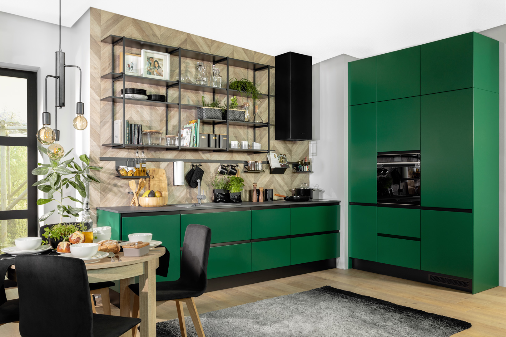
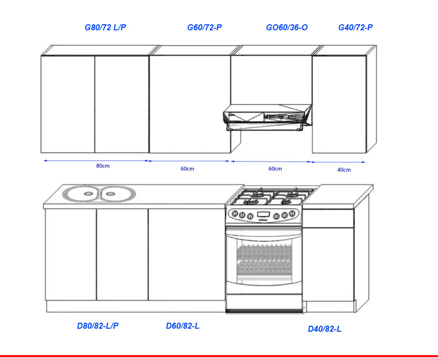
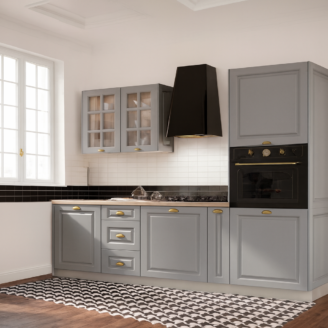
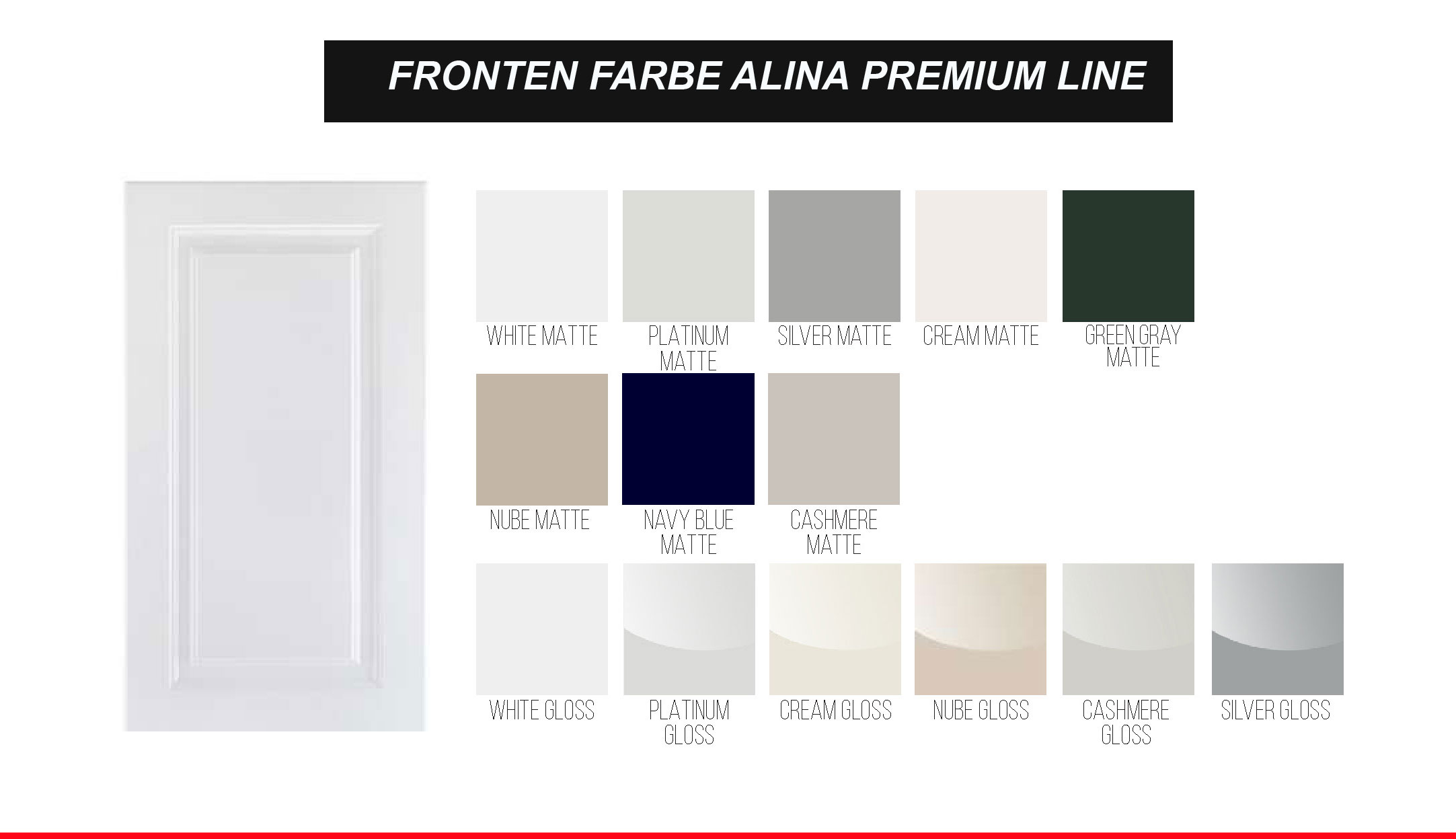
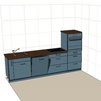
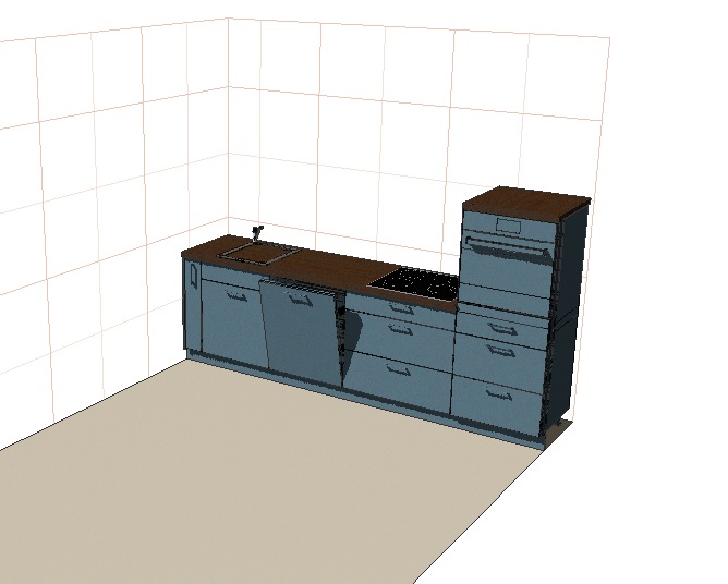
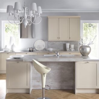
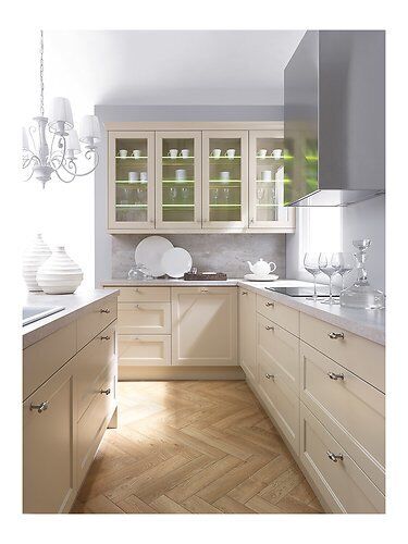
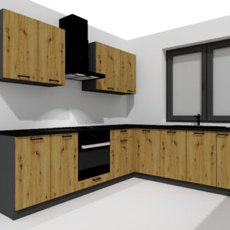
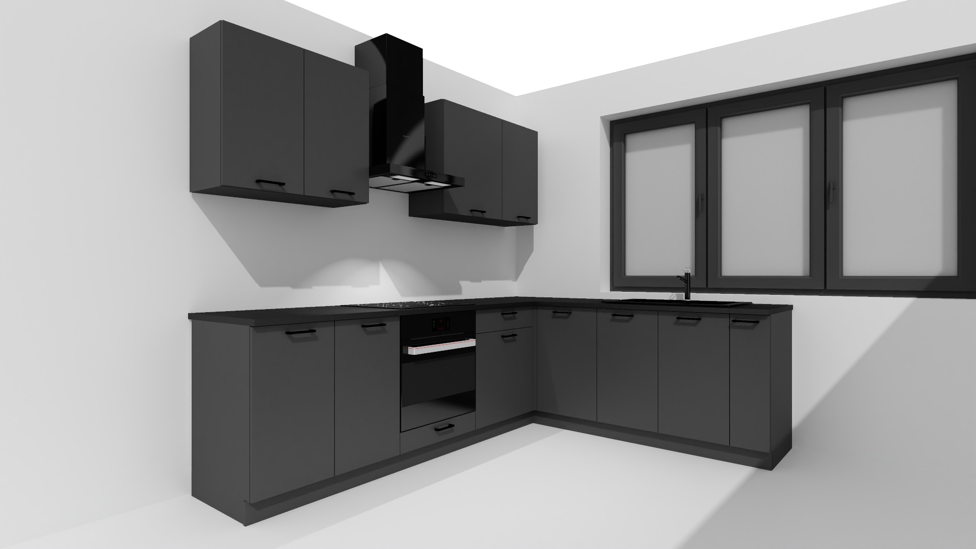
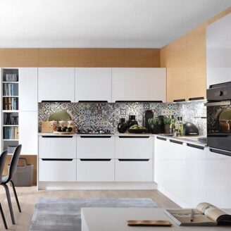
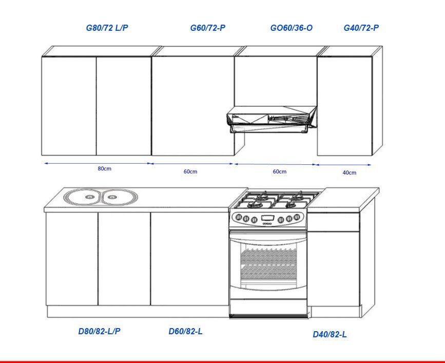
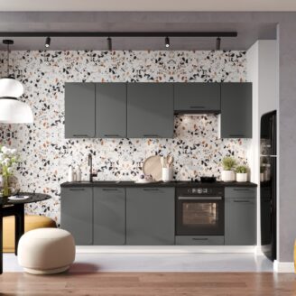
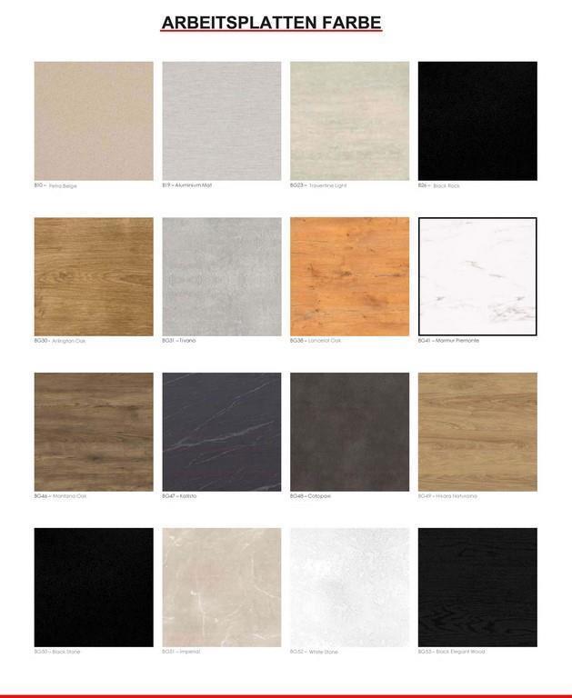
Beschreibung
body { -moz-osx-font-smoothing: grayscale; -webkit-font-smoothing: antialiased; } .pagewidth { max-width:1200pix; margin:0 auto; } *:focus { outline: 0; } .clearer::after { content: “”; display: table; clear: both; } .block { display:block !important; } .inline { display:inline !important; } .inline-block { display:inline-block !important; } .hide-mobile { display:block; } a { color:#666; } a:link { color:#666; } a:visited { color:#666; } hr { color:#ccc; height:1px; background:#ccc; border:none; } h1 { position:relative; border-bottom: 1px solid #ccc; color: #666; font-weight: 300; margin: 0 0 1em; padding: 10px 0; text-transform: uppercase; } h1::before { border-bottom: 1px solid #666; bottom: -1px; content: “”; position: absolute; width: 20%; } h2 { border-bottom: 1px solid #bbb; color: #666; display: block; font-size: 20px; font-weight: 300; padding: 10px 0; margin:1em 0; } .star-image { display: grid; } h3 { font-weight: bold; text-transform: uppercase; } @media screen and (max-width : 760px){ h2 { text:center; border-top:1px solid #bbb; padding: 10px 0 !important; margin:2em 0 1em !important; } h1 { text:center; } h1::before { display:none; } .tabs { margin-bottom:0 !important; } } #show-mobile { display:none; } #cross-selling { display:block; width:100%; } #cross-selling > div#boxwrapper { display:block !important; width:100%; } #cross-selling > div#infowrapper { display:block !important; width:100%; } .crossitem { background: #fff none repeat scroll 0 0; min-height: 420px; padding: 10px 10px 25px; text: center; transition: all 0.3s ease-in-out 0s; border: 1px solid #ccc; } .crossitem:hover { transform: scale(1.03) rotate(1.5deg); box-shadow: 0px 0px 7px #aaa; border-color: #aaa; } .crossitem a { display:block; text-decoration:none; outline:none; } .crossitem a:visited { color:#666; } .artikelname { font-weight: normal; font-size: 16px; padding:1em 0; color:#666; } .preis { font-weight: normal; font-size: 2.5em; color: #444; text-align: center; display: block; } #variation { border-top: 1px solid #ccc; font-family: sans-serif; margin: 15px 0 0; max-width: 100%; padding:15px 0; } .variation { list-style: outside none none; } .variation li { background-color: #555 !important; border: 0 !important; color: #fff !important; display: inline-block !important; font-size: 14px !important; padding: 10px 17px !important; margin: 5px 7px 5px 0 !important; } .variation li::before{ content:none !important; } @media only screen and (min-width: 1024px) { #leftcontent { min-height: 585px; } #cross-selling .boxcontainer { width:22.5%; margin:0 0.5%; float:left; display:inline-block; } #cross-selling > div#boxwrapper { display:block !important; width:100%; min-height:480px; padding:10px; } #cross-selling > div#infowrapper { display:block !important; width:100%; min-height:300px; margin-top:3em; } } #maincontainer { display:block; width:100%; max-width:1200px; margin:0 auto; font: 14px “Open Sans”, sans-serif; color:#777; overflow-x:hidden; } #maincontainer ul, #maincontainer ul li { padding:0; margin:0; list-style-position: inside; } #headerlogo { width:25%; height:80px; float:left; display:inline-block; text:left; } #headertexte { color:#666; margin:0 auto; display:inline-block; } #headerlogo img { max-width:100%; max-height:80px; } #headerlogo a { display:block; height:80px; text-decoration:none; font-size:0px; position:relative; } #headerlogo a::after { content: ” “; position: absolute; top: 0; bottom: 0; width: 100%; display: block; } #headerinfo { width:24%; float:right; display:inline-block; padding-top:27px; } #headerinfo-1 { width:100%; float:left; display:inline-block; } #headerinfo-2 { width:100%; float:left; display:inline-block; } #topicon { color: #777; font-size: 32px; display:inline-block; margin:0 auto; text:center; margin-right:10px; } span.headertext-1 { display:block; color:#777; font-size:14px; } span.headertext-2 { display:block; color:#777; font-size:10px; } #boxwrapper { width:22.5%; display:inline-block; float:left; padding-right:2.5%; } #infowrapper { width:22.5%; display:inline-block; float:left; } #bottomcontent { width:100%; display:inline-block; float:left; } #leftcontent { width:52%; display:inline-block; float:left; padding-right:3%; } #rightcontent { width:45%; display:inline-block; float:left; } #topheader { width:100%; display:inline-block; float:left; } #topcontent { width:100%; display:inline-block; float:left; margin-bottom:2.5em; } #topnavi { width:100%; display:inline-block; float:left; clear:both; } div.boxcontainer { margin-bottom:20px; } div.boxcontainer::after { content: “”; display: table; height: 15px; } .boxtitle { background: #fff none repeat scroll 0 0; border-bottom: 1px solid #ccc; display: block; font-size: 16px; font-weight: bold; padding: 15px 0 10px; position: relative; text-transform: uppercase; margin:0 10px; } .boxtitle::before { border-bottom: 1px solid #666; bottom: -1px; content: “”; position: absolute; width: 30%; } .boxcontent { display:block; padding:20px 10px; font-size:13px; background:#fff; } .boxcontent img { display:inline-block; margin:0 auto; max-width:100%; } .versand ul li::before { content: “\\f0d1” !important; display: table; clear: both; font-family: FontAwesome; display: inline; color: #666; position: relative; margin-right:5px; } #footercontainer { width:94%; margin:0 auto; } div.footer { background:#393939; padding:20px 0 0; margin:20px 0 0 ; font-size:11px; color:#fff; text:center; border-radius:3px; } #bottomcontent ul, div.boxcontainer ul{ margin:10px 0; padding:0; } #bottomcontent ul li, div.boxcontainer ul li, #rightcontent ul li, #tabinhalt ul li { margin:0; padding:5px 0; border-top:1px solid #eee; list-style:none; } #bottomcontent ul li:last-child, div.boxcontainer ul li:last-child, #rightcontent ul li:last-child , #tabinhalt ul li:last-child { border-bottom:1px solid #eee; } #bottomcontent ul li::before, div.boxcontainer ul li::before, #rightcontent ul li::before { content: “\\f14a”; display: table; clear: both; font-family: FontAwesome; display: inline; color: #666; position: relative; margin-right:5px; } #tabinhalt ul li::before { content: “\\f138”; display: table; clear: both; font-family: FontAwesome; display: inline; color: #666; position: relative; margin-right:5px; } div.boxcontainer ul li { padding:5px 0 !important; } @media only screen and (max-width : 1200px) { #maincontainer { width:95%; } } @media only screen and (max-width : 1024px) { .hide-mobile { display:none !important; } #maincontainer { width:95%; } #headerlogo { width:30%; display:inline-block; float:left; text:left; } #headerlogo a { text:center; } #headerinfo { width:30%; display:block; padding:20px 0 0px 20px; display:block; margin:0 auto; } #headerinfo-1 { width:100%; display:inline-block; float:left; } #headerinfo-2 { width:100%; display:inline-block; float:left; } #maincontent > div#boxwrapper { display:none; } #maincontent > div#infowrapper { display:none; } #maincontent > div#bottomcontent { width:100%; } #show-mobile { display:block; width:100%; } #show-mobile > div#boxwrapper { display:block !important; width:100%; } #show-mobile > div#infowrapper { display:block !important; width:100%; } #cross-selling{ display:block; width:100%; } #cross-selling > div#boxwrapper { display:block !important; width:100%; } #cross-selling > div#infowrapper { display:block !important; width:100%; margin-top:3em; } div.boxcontainer { width:48%; margin:0 0.5%; float:left; display:inline-block; min-height:310px; } } @media only screen and (max-width : 700px) { div.boxcontainer { width:100%; margin:0; display:inline-block; } .crossitem:hover { cursor: pointer; transform: none !important; box-shadow: none !important; opacity: 1; border-color: #aaa; } } @media only screen and (max-width : 780px) { #header { text:center; } #headerlogo { width:100%; display:block; text:left; } #headerinfo { width:50%; display:block; padding:15px 0 10px; display:block; margin:0 auto; } #headerinfo-1 { width:100%; display:block; float:left; } #headerinfo-2 { width:100%; display:block; float:left; } #headerinfo-1::before, #headerinfo-2::before { display:block; padding-right: 190px; } } @media only screen and (max-width : 639px) { #leftcontent, #rightcontent { width:100%; } } @media only screen and (max-width : 499px) { #headerlogo { width:100%; display:block; text:left; } #headerinfo { width:100%; display:block; padding:15px 0 10px; display:block; margin:0 auto; } #headerinfo-1 { width:100%; display:block; float:left; } #headerinfo-2 { width:100%; display:block; float:left; } #maincontent > div#boxwrapper { display:none !important; } #maincontent > div#bottomcontent { width:100% !important; } #show-mobile { display:block; } #cross-selling { display:block; } #leftcontent, #rightcontent { width:100%; } .slider { display:none; } } /*Ab hier NEU*/ #header { margin-top:20px; } .badge { background-color: #666; color: #fff; text-shadow: none; border-radius: 15px; padding-left: 15px; padding-right: 15px; display: inline-block; font-size: 11.844px; vertical-align: baseline; white-space: nowrap; font-weight:bold; line-height:25px; top:25%; position:relative; letter-spacing:1.1; } /*Top Navigation*/ #navibadge{ display:block; float:right; height:50px; margin-right:1%; } #navicontainer { margin:5px 0 20px; display:block; background:#fff; border-top:1px solid #666; border-bottom:1px solid #666; height:50px; } #navicontainer::after { content: “”; display: table; width: 100%; height: 50px; } /*Strip the ul of padding and list styling*/ #navicontainer ul { list-style-type:none; margin:0; padding:0; position: absolute; } /*Create a horizontal list with spacing*/ #navicontainer li { display:inline-block; float: left; margin-right: 1px; } /*Style for menu links*/ #navicontainer li a { display:block; min-width:30px; height: 50px; text: center; line-height: 50px; font-family: “Helvetica Neue”, Helvetica, Arial, sans-serif; color: #666; background: #fff; text-decoration: none; text-transform:uppercase; font-size:14px; letter-spacing:0.07em; transition: all 0.5s ease 0s; padding:0 20px; } /*Hover state for top level links*/ #navicontainer li:hover a { background: #666; color:#fff; transition: all 0.5s ease 0s; } /*Style for dropdown links*/ #navicontainer li:hover ul a { background: #666; color: #fff; height: 40px; line-height: 40px; } /*Hover state for dropdown links*/ #navicontainer li:hover ul a:hover { background: #333; color: #fff; } /*Hide dropdown links until they are needed*/ #navicontainer li ul { display: none; } /*Make dropdown links vertical*/ #navicontainer li ul li { display: block; float: none; } /*Prevent text wrapping*/ #navicontainer li ul li a { width: auto; min-width: 100px; padding: 0 20px; } /*Display the dropdown on hover*/ #navicontainer ul li a:hover + .hidden, .hidden:hover { display: block !important; z-index:999999; } /*Style ‘show menu’ label button and hide it by default*/ .show-menu { font-family: “Helvetica Neue”, Helvetica, Arial, sans-serif; text-decoration: none; color: #fff; background: #666; text: center; padding: 10px 0; display: none; } /*Hide checkbox*/ input[type=checkbox]{ display: none; } /*Show menu when invisible checkbox is checked*/ input[type=checkbox]:checked ~ #menu{ display: block; } /*Responsive Styles*/ @media screen and (max-width : 1200px){ #navicontainer { background:transparent; height:2em; } /*Make dropdown links appear inline*/ #navicontainer ul { position: static; display: none; } /*Create vertical spacing*/ #navicontainer li { margin-bottom: 1px; } #navicontainer li a { border-bottom:1px solid #bbb; padding:0; } #navicontainer ul li:last-child a { margin-bottom:1em; } /*Make all menu links full width*/ #navicontainer ul li, li a { width: 100%; } /*Display ‘show menu’ link*/ .show-menu { display:block; cursor:pointer; } .show-menu::before { content: “\\f039″; display: table; clear: both; font-family: FontAwesome; display: inline; color: #fff; position: relative; margin-right: 15px; } } @media screen and (max-width : 1200px){ #navibadge{ display:none; } } /*Ab hier Slider*/ .slider { padding: 0; margin: 0; max-width: 99%; margin: 0 auto; overflow: hidden; border-radius: 3px; margin-bottom:1em; box-shadow:0px 0px 5px #888; } .slider ul { width: 1000%; height: auto; position: relative; list-style: none; left: 0; margin: 0; padding: 0; line-height: 0; -moz-animation:slide-animation 20s infinite; -webkit-animation:slide-animation 20s infinite; } .slider ul:hover { -moz-animation-play-state:paused; -webkit-animation-play-state:paused; } .slider li { width: 10%; list-style: none; float: left; margin: 0; padding: 0; } img { max-width: 100%; } @-webkit-keyframes slide-animation { 1% { left: 0%; opacity: 1; } 18% { left: 0%; opacity: 1} 19% { opacity: 0.2; } 20% { left: -100%; opacity: 1; } 58% { left: -100%; opacity: 1; } 59% { opacity: 0.2; } 60% { left: -200%; opacity: 1; } 98% { left: -200%; opacity: 1; } 99% { opacity: 0.5; } 100% { left: 0%; } } @-moz-keyframes slide-animation { 1% { left: 0%; opacity: 1; } 18% { left: 0%; opacity: 1} 19% { opacity: 0.2; } 20% { left: -100%; opacity: 1; } 58% { left: -100%; opacity: 1; } 59% { opacity: 0.2; } 60% { left: -200%; opacity: 1; } 98% { left: -200%; opacity: 1; } 99% { opacity: 0.5; } 100% { left: 0%; } } /*Tabs*/ .tabs { max-width: 100%; float: none; list-style: none; padding: 0; margin: 0 auto 2em; } .tabs::after { content: ”; display: table; clear: both; } #tab-content2, #tab-content3 { display: none; } .tabs input[type=”radio”] { display:none; } .tabs label { display: block; float: left; width: 33.3333%; color: #ccc; font-size: 23px; font-weight: 100; text-decoration: none; text: center; line-height: 2; cursor: pointer; box-shadow: inset 0 1px #ccc; border-bottom: 1px solid #ccc; -webkit-transition: all 0.5s; /* Safari 3.1 to 6.0 */ transition: all 0.5s; letter-spacing:0.05em; } .tabs label span { display: none; } .tabs label i { padding: 5px; margin-right: 0; } .tabs label:hover { color: #666; box-shadow: inset 0 1px #666; border-bottom: 1px solid #666; } .tabcontent { width: 100%; float: left; padding: 15px; box-sizing: border-box; background-color:transparent; } #tab1:checked + label, #tab2:checked + label, #tab3:checked + label { background: transperent; box-shadow: inset 0 1px #666; border-bottom: 1px solid #666; color: #666; } #tab1:checked ~ #tab-content1 { display: block; } #tab1:checked ~ #tab-content2, #tab1:checked ~ #tab-content3 { display: none; } #tab2:checked ~ #tab-content2 { display: block; } #tab2:checked ~ #tab-content1, #tab2:checked ~ #tab-content3 { display: none; } #tab3:checked ~ #tab-content3 { display: block; } #tab3:checked ~ #tab-content1, #tab3:checked ~ #tab-content2 { display: none; } #tab5:checked + label, #tab6:checked + label, #tab7:checked + label { background: transperent; box-shadow: inset 0 1px #666; border-bottom: 1px solid #666; color: #666; } #tab5:checked ~ #tab-content5 { display: block; } #tab5:checked ~ #tab-content6, #tab5:checked ~ #tab-content7 { display: none; } #tab6:checked ~ #tab-content6 { display: block; } #tab6:checked ~ #tab-content5, #tab6:checked ~ #tab-content7 { display: none; } #tab7:checked ~ #tab-content7 { display: block; } #tab7:checked ~ #tab-content5, #tab7:checked ~ #tab-content5 { display: none; } .animiert { animation-duration: 1s; animation-fill-mode: both; } @keyframes scale { 0% { transform: scale(0.9); opacity: 0; } 50% { transform: scale(1.01); opacity: 0.5; } 100% { transform: scale(1); opacity: 1; } } .scale { animation-name: scale; } @media (min-width: 768px) { .tabs i { padding: 5px; margin-right: 10px; } .tabs label span { display: inline-block; } .tabs { max-width: 100%; margin: 0 auto 1em; padding-top:32px; } } /*Start Gallery*/ .gallery{ width: 100%; /*Same as width of the large image*/ position: relative; height:auto; padding-top: 75%; /*That helps bring the labels down*/ margin-top:5px; } /*Last thing remaining is to add transitions*/ .gallery>img{ position: absolute; left: 0; top: 0; right:0; bottom:0; transition: all 0.5s; height:auto; max-width:100%; max-height:100%; margin:auto; } .gallery input[name=’gallery_switch’] { display: none; visibility:hidden; } .gallery label { /*Lets add some spacing for the thumbnails*/ margin: 18px 0 10px 15px; border: 3px solid #999; float: left; cursor: pointer; transition: all 0.5s; /*Default style = low opacity*/ opacity: 0.6; } .gallery label img{ display: block; height:75px; width:auto; } /*Time to add the click effects*/ .gallery input[name=’gallery_switch’]:checked+label { border-color: #666; opacity: 1; visibility:visible; } /*Clicking any thumbnail now should change its opacity(style)*/ /*Time to work on the main images*/ .gallery input[name=’gallery_switch’] ~ img { opacity: 0; transform: scale(1.1); visibility:hidden; } /*That hides all main images at a 110% size On click the images will be displayed at normal size to complete the effect */ .gallery input[name=’gallery_switch’]:checked+label+img { opacity: 1; transform: scale(1); visibility:visible; } .bloct-text { display: block; } .text { text: justify; } .text-head-2 { color:#ff6600; font-size:28px; text-align:center; font-weight: bold; } .bold { font-weight: bold; } .versand > img { display: block; margin: 0 auto; width: 50%; margin-top: 2em; } small { font-size: 14px; } img.img { display: block; margin: 0 auto; padding: 0.5em; } img.img-crossselling { display: block; margin: 0 auto; max-height: 230px; } img.img-crossselling { height: 220px; } .text-head { color: #ab9d95 !important; font-weight: bold; font-size: 14px !important; text-align: center !important; height:80px !important; }
Freeman Manka –
Regards for this grand post, I am glad I detected this website on yahoo.
http://www.tlovertonet.com/
Nicht verifizierter Kauf. Mehr Informationen