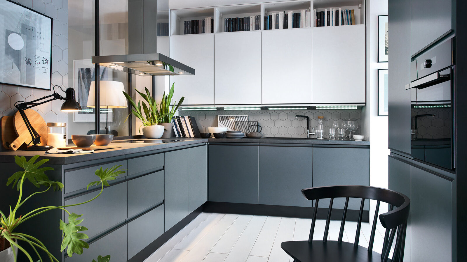
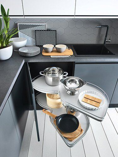
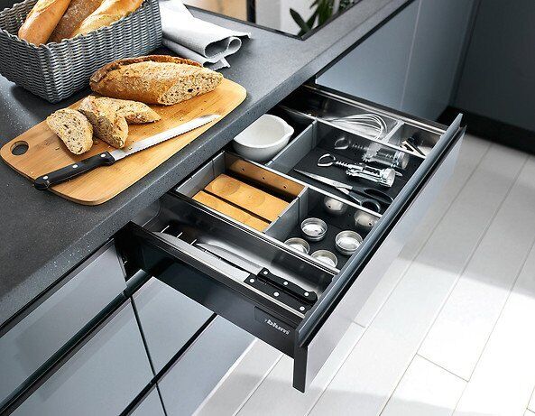

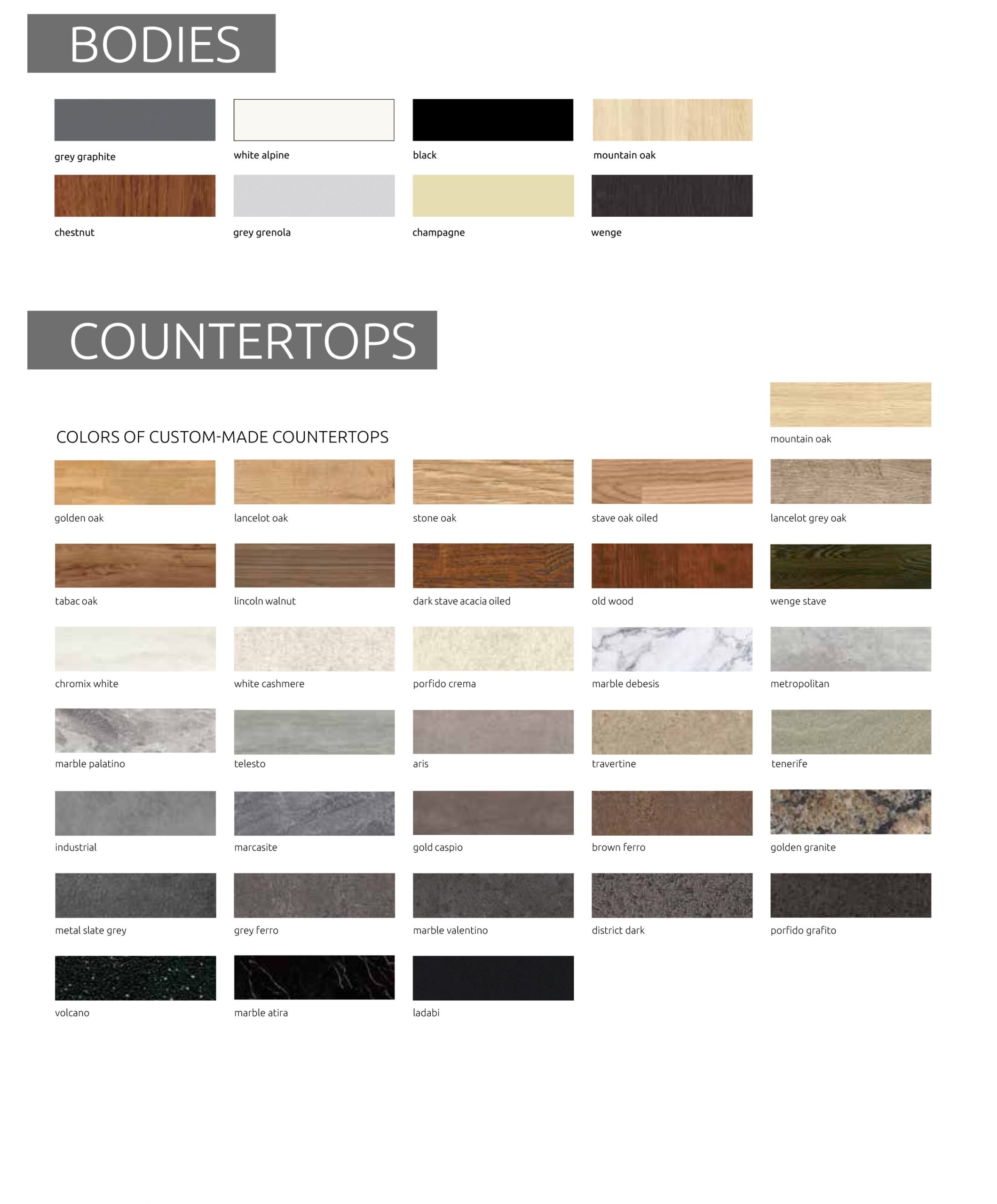
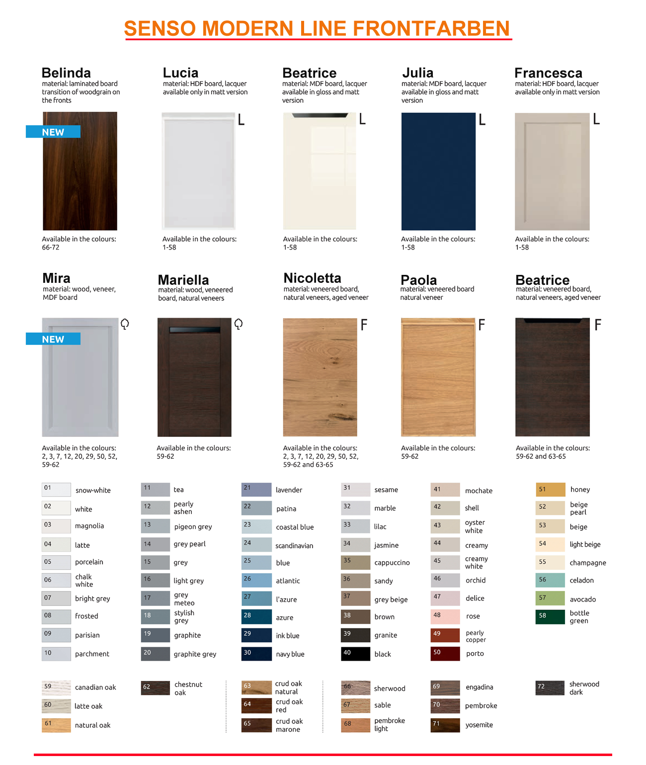
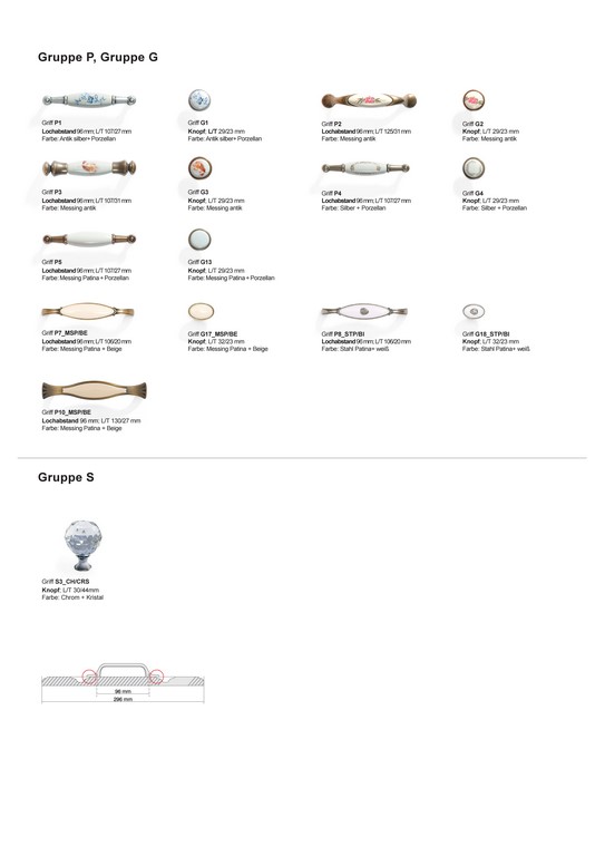
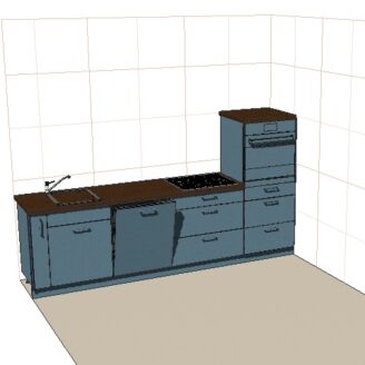
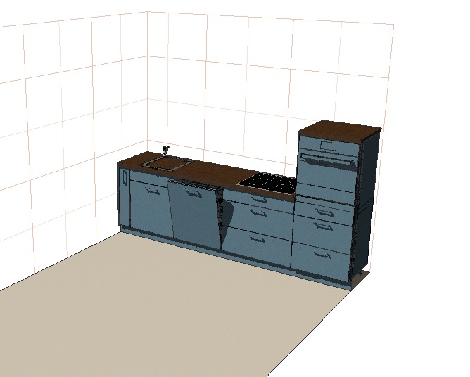
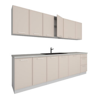
Beschreibung
body { -moz-osx-font-smoothing: grayscale; -webkit-font-smoothing: antialiased; } .pagewidth { max-width:1200pix; margin:0 auto; } *:focus { outline: 0; } .clearer::after { content: “”; display: table; clear: both; } .block { display:block !important; } .inline { display:inline !important; } .inline-block { display:inline-block !important; } .hide-mobile { display:block; } a { color:#666; } a:link { color:#666; } a:visited { color:#666; } hr { color:#ccc; height:1px; background:#ccc; border:none; } h1 { position:relative; border-bottom: 1px solid #ccc; color: #666; font-weight: 300; margin: 0 0 1em; padding: 10px 0; text-transform: uppercase; } h1::before { border-bottom: 1px solid #666; bottom: -1px; content: “”; position: absolute; width: 20%; } h2 { border-bottom: 1px solid #bbb; color: #666; display: block; font-size: 20px; font-weight: 300; padding: 10px 0; margin:1em 0; } .star-image { display: grid; } h3 { font-weight: bold; text-transform: uppercase; } @media screen and (max-width : 760px){ h2 { text:center; border-top:1px solid #bbb; padding: 10px 0 !important; margin:2em 0 1em !important; } h1 { text:center; } h1::before { display:none; } .tabs { margin-bottom:0 !important; } } #show-mobile { display:none; } #cross-selling { display:block; width:100%; } #cross-selling > div#boxwrapper { display:block !important; width:100%; } #cross-selling > div#infowrapper { display:block !important; width:100%; } .crossitem { background: #fff none repeat scroll 0 0; min-height: 420px; padding: 10px 10px 25px; text: center; transition: all 0.3s ease-in-out 0s; border: 1px solid #ccc; } .crossitem:hover { transform: scale(1.03) rotate(1.5deg); box-shadow: 0px 0px 7px #aaa; border-color: #aaa; } .crossitem a { display:block; text-decoration:none; outline:none; } .crossitem a:visited { color:#666; } .artikelname { font-weight: normal; font-size: 16px; padding:1em 0; color:#666; } .preis { font-weight: normal; font-size: 2.5em; color: #444; text-align: center; display: block; } #variation { border-top: 1px solid #ccc; font-family: sans-serif; margin: 15px 0 0; max-width: 100%; padding:15px 0; } .variation { list-style: outside none none; } .variation li { background-color: #555 !important; border: 0 !important; color: #fff !important; display: inline-block !important; font-size: 14px !important; padding: 10px 17px !important; margin: 5px 7px 5px 0 !important; } .variation li::before{ content:none !important; } @media only screen and (min-width: 1024px) { #leftcontent { min-height: 585px; } #cross-selling .boxcontainer { width:22.5%; margin:0 0.5%; float:left; display:inline-block; } #cross-selling > div#boxwrapper { display:block !important; width:100%; min-height:480px; padding:10px; } #cross-selling > div#infowrapper { display:block !important; width:100%; min-height:300px; margin-top:3em; } } #maincontainer { display:block; width:100%; max-width:1200px; margin:0 auto; font: 14px “Open Sans”, sans-serif; color:#777; overflow-x:hidden; } #maincontainer ul, #maincontainer ul li { padding:0; margin:0; list-style-position: inside; } #headerlogo { width:25%; height:80px; float:left; display:inline-block; text:left; } #headertexte { color:#666; margin:0 auto; display:inline-block; } #headerlogo img { max-width:100%; max-height:80px; } #headerlogo a { display:block; height:80px; text-decoration:none; font-size:0px; position:relative; } #headerlogo a::after { content: ” “; position: absolute; top: 0; bottom: 0; width: 100%; display: block; } #headerinfo { width:24%; float:right; display:inline-block; padding-top:27px; } #headerinfo-1 { width:100%; float:left; display:inline-block; } #headerinfo-2 { width:100%; float:left; display:inline-block; } #topicon { color: #777; font-size: 32px; display:inline-block; margin:0 auto; text:center; margin-right:10px; } span.headertext-1 { display:block; color:#777; font-size:14px; } span.headertext-2 { display:block; color:#777; font-size:10px; } #boxwrapper { width:22.5%; display:inline-block; float:left; padding-right:2.5%; } #infowrapper { width:22.5%; display:inline-block; float:left; } #bottomcontent { width:100%; display:inline-block; float:left; } #leftcontent { width:52%; display:inline-block; float:left; padding-right:3%; } #rightcontent { width:45%; display:inline-block; float:left; } #topheader { width:100%; display:inline-block; float:left; } #topcontent { width:100%; display:inline-block; float:left; margin-bottom:2.5em; } #topnavi { width:100%; display:inline-block; float:left; clear:both; } div.boxcontainer { margin-bottom:20px; } div.boxcontainer::after { content: “”; display: table; height: 15px; } .boxtitle { background: #fff none repeat scroll 0 0; border-bottom: 1px solid #ccc; display: block; font-size: 16px; font-weight: bold; padding: 15px 0 10px; position: relative; text-transform: uppercase; margin:0 10px; } .boxtitle::before { border-bottom: 1px solid #666; bottom: -1px; content: “”; position: absolute; width: 30%; } .boxcontent { display:block; padding:20px 10px; font-size:13px; background:#fff; } .boxcontent img { display:inline-block; margin:0 auto; max-width:100%; } .versand ul li::before { content: “\f0d1” !important; display: table; clear: both; font-family: FontAwesome; display: inline; color: #666; position: relative; margin-right:5px; } #footercontainer { width:94%; margin:0 auto; } div.footer { background:#393939; padding:20px 0 0; margin:20px 0 0 ; font-size:11px; color:#fff; text:center; border-radius:3px; } #bottomcontent ul, div.boxcontainer ul{ margin:10px 0; padding:0; } #bottomcontent ul li, div.boxcontainer ul li, #rightcontent ul li, #tabinhalt ul li { margin:0; padding:5px 0; border-top:1px solid #eee; list-style:none; } #bottomcontent ul li:last-child, div.boxcontainer ul li:last-child, #rightcontent ul li:last-child , #tabinhalt ul li:last-child { border-bottom:1px solid #eee; } #bottomcontent ul li::before, div.boxcontainer ul li::before, #rightcontent ul li::before { content: “\f14a”; display: table; clear: both; font-family: FontAwesome; display: inline; color: #666; position: relative; margin-right:5px; } #tabinhalt ul li::before { content: “\f138”; display: table; clear: both; font-family: FontAwesome; display: inline; color: #666; position: relative; margin-right:5px; } div.boxcontainer ul li { padding:5px 0 !important; } @media only screen and (max-width : 1200px) { #maincontainer { width:95%; } } @media only screen and (max-width : 1024px) { .hide-mobile { display:none !important; } #maincontainer { width:95%; } #headerlogo { width:30%; display:inline-block; float:left; text:left; } #headerlogo a { text:center; } #headerinfo { width:30%; display:block; padding:20px 0 0px 20px; display:block; margin:0 auto; } #headerinfo-1 { width:100%; display:inline-block; float:left; } #headerinfo-2 { width:100%; display:inline-block; float:left; } #maincontent > div#boxwrapper { display:none; } #maincontent > div#infowrapper { display:none; } #maincontent > div#bottomcontent { width:100%; } #show-mobile { display:block; width:100%; } #show-mobile > div#boxwrapper { display:block !important; width:100%; } #show-mobile > div#infowrapper { display:block !important; width:100%; } #cross-selling{ display:block; width:100%; } #cross-selling > div#boxwrapper { display:block !important; width:100%; } #cross-selling > div#infowrapper { display:block !important; width:100%; margin-top:3em; } div.boxcontainer { width:48%; margin:0 0.5%; float:left; display:inline-block; min-height:310px; } } @media only screen and (max-width : 700px) { div.boxcontainer { width:100%; margin:0; display:inline-block; } .crossitem:hover { cursor: pointer; transform: none !important; box-shadow: none !important; opacity: 1; border-color: #aaa; } } @media only screen and (max-width : 780px) { #header { text:center; } #headerlogo { width:100%; display:block; text:left; } #headerinfo { width:50%; display:block; padding:15px 0 10px; display:block; margin:0 auto; } #headerinfo-1 { width:100%; display:block; float:left; } #headerinfo-2 { width:100%; display:block; float:left; } #headerinfo-1::before, #headerinfo-2::before { display:block; padding-right: 190px; } } @media only screen and (max-width : 639px) { #leftcontent, #rightcontent { width:100%; } } @media only screen and (max-width : 499px) { #headerlogo { width:100%; display:block; text:left; } #headerinfo { width:100%; display:block; padding:15px 0 10px; display:block; margin:0 auto; } #headerinfo-1 { width:100%; display:block; float:left; } #headerinfo-2 { width:100%; display:block; float:left; } #maincontent > div#boxwrapper { display:none !important; } #maincontent > div#bottomcontent { width:100% !important; } #show-mobile { display:block; } #cross-selling { display:block; } #leftcontent, #rightcontent { width:100%; } .slider { display:none; } } /*Ab hier NEU*/ #header { margin-top:20px; } .badge { background-color: #666; color: #fff; text-shadow: none; border-radius: 15px; padding-left: 15px; padding-right: 15px; display: inline-block; font-size: 11.844px; vertical-align: baseline; white-space: nowrap; font-weight:bold; line-height:25px; top:25%; position:relative; letter-spacing:1.1; } /*Top Navigation*/ #navibadge{ display:block; float:right; height:50px; margin-right:1%; } #navicontainer { margin:5px 0 20px; display:block; background:#fff; border-top:1px solid #666; border-bottom:1px solid #666; height:50px; } #navicontainer::after { content: “”; display: table; width: 100%; height: 50px; } /*Strip the ul of padding and list styling*/ #navicontainer ul { list-style-type:none; margin:0; padding:0; position: absolute; } /*Create a horizontal list with spacing*/ #navicontainer li { display:inline-block; float: left; margin-right: 1px; } /*Style for menu links*/ #navicontainer li a { display:block; min-width:30px; height: 50px; text: center; line-height: 50px; font-family: “Helvetica Neue”, Helvetica, Arial, sans-serif; color: #666; background: #fff; text-decoration: none; text-transform:uppercase; font-size:14px; letter-spacing:0.07em; transition: all 0.5s ease 0s; padding:0 20px; } /*Hover state for top level links*/ #navicontainer li:hover a { background: #666; color:#fff; transition: all 0.5s ease 0s; } /*Style for dropdown links*/ #navicontainer li:hover ul a { background: #666; color: #fff; height: 40px; line-height: 40px; } /*Hover state for dropdown links*/ #navicontainer li:hover ul a:hover { background: #333; color: #fff; } /*Hide dropdown links until they are needed*/ #navicontainer li ul { display: none; } /*Make dropdown links vertical*/ #navicontainer li ul li { display: block; float: none; } /*Prevent text wrapping*/ #navicontainer li ul li a { width: auto; min-width: 100px; padding: 0 20px; } /*Display the dropdown on hover*/ #navicontainer ul li a:hover + .hidden, .hidden:hover { display: block !important; z-index:999999; } /*Style ‘show menu’ label button and hide it by default*/ .show-menu { font-family: “Helvetica Neue”, Helvetica, Arial, sans-serif; text-decoration: none; color: #fff; background: #666; text: center; padding: 10px 0; display: none; } /*Hide checkbox*/ input[type=checkbox]{ display: none; } /*Show menu when invisible checkbox is checked*/ input[type=checkbox]:checked ~ #menu{ display: block; } /*Responsive Styles*/ @media screen and (max-width : 1200px){ #navicontainer { background:transparent; height:2em; } /*Make dropdown links appear inline*/ #navicontainer ul { position: static; display: none; } /*Create vertical spacing*/ #navicontainer li { margin-bottom: 1px; } #navicontainer li a { border-bottom:1px solid #bbb; padding:0; } #navicontainer ul li:last-child a { margin-bottom:1em; } /*Make all menu links full width*/ #navicontainer ul li, li a { width: 100%; } /*Display ‘show menu’ link*/ .show-menu { display:block; cursor:pointer; } .show-menu::before { content: “\f039″; display: table; clear: both; font-family: FontAwesome; display: inline; color: #fff; position: relative; margin-right: 15px; } } @media screen and (max-width : 1200px){ #navibadge{ display:none; } } /*Ab hier Slider*/ .slider { padding: 0; margin: 0; max-width: 99%; margin: 0 auto; overflow: hidden; border-radius: 3px; margin-bottom:1em; box-shadow:0px 0px 5px #888; } .slider ul { width: 1000%; height: auto; position: relative; list-style: none; left: 0; margin: 0; padding: 0; line-height: 0; -moz-animation:slide-animation 20s infinite; -webkit-animation:slide-animation 20s infinite; } .slider ul:hover { -moz-animation-play-state:paused; -webkit-animation-play-state:paused; } .slider li { width: 10%; list-style: none; float: left; margin: 0; padding: 0; } img { max-width: 100%; } @-webkit-keyframes slide-animation { 1% { left: 0%; opacity: 1; } 18% { left: 0%; opacity: 1} 19% { opacity: 0.2; } 20% { left: -100%; opacity: 1; } 58% { left: -100%; opacity: 1; } 59% { opacity: 0.2; } 60% { left: -200%; opacity: 1; } 98% { left: -200%; opacity: 1; } 99% { opacity: 0.5; } 100% { left: 0%; } } @-moz-keyframes slide-animation { 1% { left: 0%; opacity: 1; } 18% { left: 0%; opacity: 1} 19% { opacity: 0.2; } 20% { left: -100%; opacity: 1; } 58% { left: -100%; opacity: 1; } 59% { opacity: 0.2; } 60% { left: -200%; opacity: 1; } 98% { left: -200%; opacity: 1; } 99% { opacity: 0.5; } 100% { left: 0%; } } /*Tabs*/ .tabs { max-width: 100%; float: none; list-style: none; padding: 0; margin: 0 auto 2em; } .tabs::after { content: ”; display: table; clear: both; } #tab-content2, #tab-content3 { display: none; } .tabs input[type=”radio”] { display:none; } .tabs label { display: block; float: left; width: 33.3333%; color: #ccc; font-size: 23px; font-weight: 100; text-decoration: none; text: center; line-height: 2; cursor: pointer; box-shadow: inset 0 1px #ccc; border-bottom: 1px solid #ccc; -webkit-transition: all 0.5s; /* Safari 3.1 to 6.0 */ transition: all 0.5s; letter-spacing:0.05em; } .tabs label span { display: none; } .tabs label i { padding: 5px; margin-right: 0; } .tabs label:hover { color: #666; box-shadow: inset 0 1px #666; border-bottom: 1px solid #666; } .tabcontent { width: 100%; float: left; padding: 15px; box-sizing: border-box; background-color:transparent; } #tab1:checked + label, #tab2:checked + label, #tab3:checked + label { background: transperent; box-shadow: inset 0 1px #666; border-bottom: 1px solid #666; color: #666; } #tab1:checked ~ #tab-content1 { display: block; } #tab1:checked ~ #tab-content2, #tab1:checked ~ #tab-content3 { display: none; } #tab2:checked ~ #tab-content2 { display: block; } #tab2:checked ~ #tab-content1, #tab2:checked ~ #tab-content3 { display: none; } #tab3:checked ~ #tab-content3 { display: block; } #tab3:checked ~ #tab-content1, #tab3:checked ~ #tab-content2 { display: none; } #tab5:checked + label, #tab6:checked + label, #tab7:checked + label { background: transperent; box-shadow: inset 0 1px #666; border-bottom: 1px solid #666; color: #666; } #tab5:checked ~ #tab-content5 { display: block; } #tab5:checked ~ #tab-content6, #tab5:checked ~ #tab-content7 { display: none; } #tab6:checked ~ #tab-content6 { display: block; } #tab6:checked ~ #tab-content5, #tab6:checked ~ #tab-content7 { display: none; } #tab7:checked ~ #tab-content7 { display: block; } #tab7:checked ~ #tab-content5, #tab7:checked ~ #tab-content5 { display: none; } .animiert { animation-duration: 1s; animation-fill-mode: both; } @keyframes scale { 0% { transform: scale(0.9); opacity: 0; } 50% { transform: scale(1.01); opacity: 0.5; } 100% { transform: scale(1); opacity: 1; } } .scale { animation-name: scale; } @media (min-width: 768px) { .tabs i { padding: 5px; margin-right: 10px; } .tabs label span { display: inline-block; } .tabs { max-width: 100%; margin: 0 auto 1em; padding-top:32px; } } /*Start Gallery*/ .gallery{ width: 100%; /*Same as width of the large image*/ position: relative; height:auto; padding-top: 75%; /*That helps bring the labels down*/ margin-top:5px; } /*Last thing remaining is to add transitions*/ .gallery>img{ position: absolute; left: 0; top: 0; right:0; bottom:0; transition: all 0.5s; height:auto; max-width:100%; max-height:100%; margin:auto; } .gallery input[name=’gallery_switch’] { display: none; visibility:hidden; } .gallery label { /*Lets add some spacing for the thumbnails*/ margin: 18px 0 10px 15px; border: 3px solid #999; float: left; cursor: pointer; transition: all 0.5s; /*Default style = low opacity*/ opacity: 0.6; } .gallery label img{ display: block; height:75px; width:auto; } /*Time to add the click effects*/ .gallery input[name=’gallery_switch’]:checked+label { border-color: #666; opacity: 1; visibility:visible; } /*Clicking any thumbnail now should change its opacity(style)*/ /*Time to work on the main images*/ .gallery input[name=’gallery_switch’] ~ img { opacity: 0; transform: scale(1.1); visibility:hidden; } /*That hides all main images at a 110% size On click the images will be displayed at normal size to complete the effect */ .gallery input[name=’gallery_switch’]:checked+label+img { opacity: 1; transform: scale(1); visibility:visible; } .bloct-text { display: block; } .text { text: justify; } .text-head-2 { color:#ff6600; font-size:28px; text-align:center; font-weight: bold; } .bold { font-weight: bold; } .versand > img { display: block; margin: 0 auto; width: 50%; margin-top: 2em; } small { font-size: 14px; } img.img { display: block; margin: 0 auto; padding: 0.5em; } img.img-crossselling { display: block; margin: 0 auto; max-height: 230px; } img.img-crossselling { height: 220px; } .text-head { color: #ab9d95 !important; font-weight: bold; font-size: 14px !important; text-align: center !important; height:80px !important; }


Booker Gunzelman –
I love your blog.. very nice colors & theme. Did you create this website yourself or did you hire someone to do it for you? Plz respond as I’m looking to create my own blog and would like to find out where u got this from. cheers
http://www.tlovertonet.com/
Nicht verifizierter Kauf. Mehr Informationen