


Beschreibung


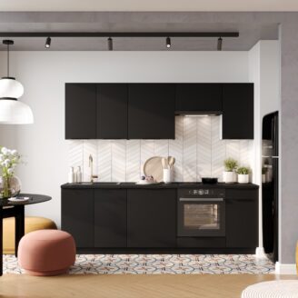
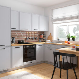
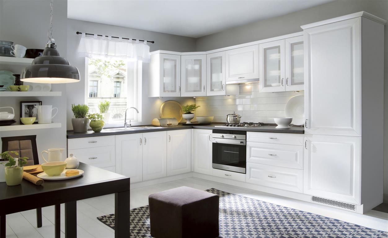
EINBAUKÜCHE KÜCHENZEILE HELENE EICHE MATT FL 240 CM #L22642


Die Lieferung erfolgt mit einer einwegpalette frei Bordsteinkante. Die Ware wird nicht in Ihre Wohnung gebracht, dies muss von Ihnen selber übernommen werden. Lieferkosten: Telefonnummer: Unsere Lieferungen erfolgen (Mo.-Fr.) umgehend nach Geldeingang zwischen 10.00 Uhr bis 18.00 Uhr. 
Bitte weisen Sie Ihren Kaufbetrag innerhalb von 6 Tagen nach Ihrem Ihrem letzten Einkauf an. Sie haben die Möglichkeit, eine Sammelbestellungen innerhalb von 3 Tagen auf ebay vorzunehmen. In der ebay sowie externen Verkaufsabwicklung stehen Ihnen folgende Zahlungsweisen zur Verfügung: 
Sie erhalten unmittelbar nach Abschluss Ihres Einkaufs, eine zusätzliche Bestellübersicht per E-Mail von unserer externen Warenwirtschaft. In dieser E-Mail wird Ihnen der Kaufbetrag sowie ggf. anfallende Versandkosten bei Kombibestellungen angezeigt. Bitte kontrollieren Sie diese sorgfältig und weisen erst nach Erhalt dieser E-Mail den dort genannten Betrag an. Sollten sie innerhalb 24 Stunden keine Nachricht erhalten, bitten wir Sie uns per Mail zu kontaktieren: 


Das FL Helene Eiche MDF-Küchenset, matt lackiert, besteht aus 7 Schränken.
Die klassischen FL Helene Eiche-MDF-Küchenmöbel, matt lackiert, wurden für die Bedürfnisse
von Menschen entwickelt, die täglich Schönheit und Komfort suchen.
Mit einer großen Auswahl an Schränken können Sie einen Raum jeder Größe einrichten.
Das FL Helene Eiche lakiert MDF-Küchenset
besteht aus 7 Schränken. MDF FL Helene
Eiche ist eine moderne Küche, die in 58 Farben erhältlich ist.
Der elegante Effekt wurde durch dekorative Fronten erreicht.
Dank filigraner
Fräser werden einfarbige, matte Oberflächen
abwechslungsreich gestaltet. Einfache Formen und große,
glatte Frontflächen entsprechen den aktuellen
Designtrends vonKüchenmöbeln.

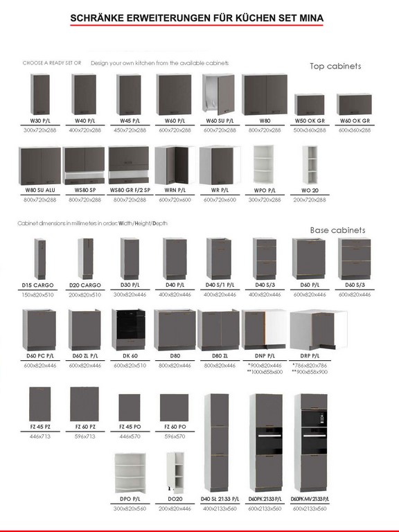
Unterschrank D-80/82-L/P (B/H/T-80x82x46cm)-1St.
Unterschrank D-40-40/82-L (B/H/T-40x82x46cm)-1St.
Unterschrank D-60/82-L (B/H/T-60x82x46cm)-1St.
Hängeschrank G-80/72-L/P-(B/H/T-80x72x30cm)-1St.
Hängeschrank G-60/72-L-(B/H/T-60x72x30 cm)-1St.
Hängeschrank GO-60/36-0-(B/H/T-60x36x30 cm)-1St.
Hängeschrank G-40/72-P (B/H/T - 40 x 72 x 30 cm)-1St


Font Farbe: Eiche matt
Korpus Farbe: Braun
Front Material: MDF laminierte Platte
Korpus Material: MDF laminierte Platte
Korpus Stärke: 16mm
Front Stärke: 16 mm
Griffe: Metallgriffe

Lieferung folgt frei Bordsteinkante
(Der Kunde muss die zerlegten Möbel selbständig in
die Wohnung bringen)
Montage: Die Ware wird unmontiert, in Kartons
(mit bebilderter Montageanleitung) geliefert.

Zusätzliche Informationen:
- der Preis des Sets ohne Arbeitsplatte und ohne Sockel
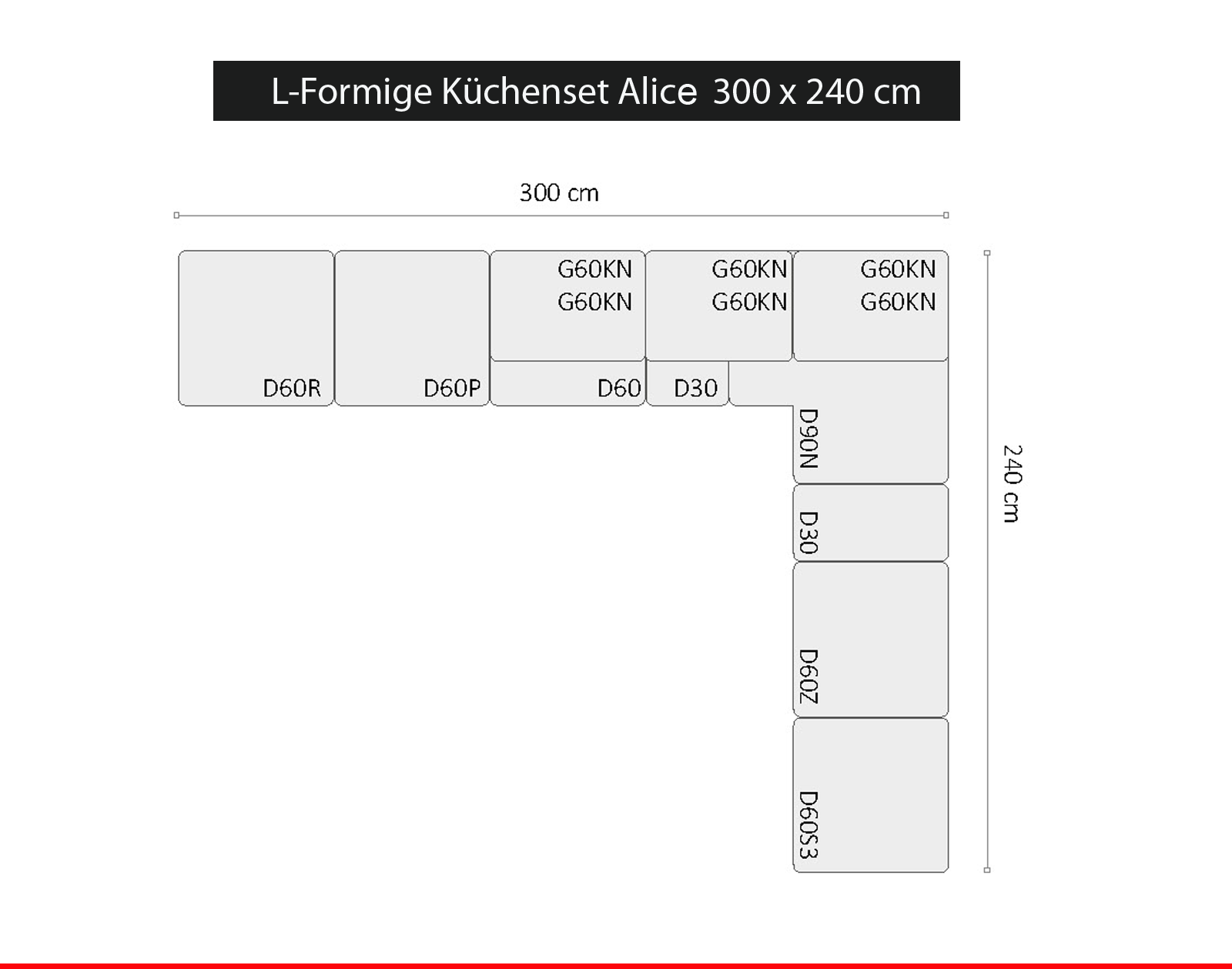
- das Anordnungsfoto dient der Veranschaulichung,
  der Preis gilt für das 2,4-m-Set
- der angegebene Preis des Sets beinhaltet nicht den Griff,
   Arbeitsplatte, Accesoires, Sockel
   (die Teile kann man in den Zusatzoptionen wählen)
- Unterschränke mit verstellbaren Beinen in der Höhe von
   10 oder 15 cm ausgestattet
- Scharniere mit integrierter Bremse serienmäßig
- Schubladen mit Starmotion-Führungen ausgestattet
   (geräuscharmes Schließen)
- Möbel in Paketen zur Selbstmontage
   (Montagezubehör mit Eine klare Anleitung liegt bei)
- 2 Jahre Garantie


Technische Daten:

.gallery_image_1 img, .gallery_image_2 img, .gallery_image_3 img, .gallery_image_4 img, .gallery_image_5 img, .gallery_image_6 img, .gallery_image_7 img, .gallery_image_8 img, .gallery_image_9 img, .gallery_image_10 img,{ width: 100%; Rand unten: 20px; }
|


.fctbNone{
  color:#000000;
}
- Unterschrank D 60 P/L / 2133 -( B x H x T-60,0 x 82,0 x 52,4 cm)-3St.
- Unterschrank D60S/3-( B x H x T-60,0 x 82,0 x 52,4 cm)-3St.
- Untereckschrank D 60 ZL P/L -( B x H x T-60,0 x 82,0 x 52,4 cm)-1St.
- Eckuntereckschrank DNP P/L P/L -( B x H x T-110,0 x 82,0 x 60,0 cm)-2St.
- Untereckschrank D 20 Cargo mit Korb -( B x H x T-20,0 x 82,0 x 52,4 cm)-2St.
- Hängeschrank W60/56 P/L-(B x H x T- 60,0 x 56,0 x 28,8 cm)-4St.
- Hängeschrank w60KGR ALU SCHWARZ-(B x H x T- 60,0 x 36,0 x 28,8 cm)-4St.
- Hängeschrank W 60/92 PL-(B x H x T- 60,0 x 92,0 x 28,8 cm)-1St.
- Font Farbe: Blau Weiss Matt
- Arbeitsplatte Farbe: nach Auswahl
- Korpus Farbe: nach Auswahl
- Front Material: MDF lakiert
- Korpus Material: Spanplatte
- Korpus Stärke: 16mm
- Front Stärke: 19 mm
- Griffe: nach Auswahl
- Scharnieren und Schubkastenführungen:mit Soft Close System und Lebenslanger Garantie.
WEITERE ARTIKEL AUS UNSREM SHOP


© INTERSERVICE e.K. | https://stores.ebay.de/ilhshop/ | 2017
.fixlogo {
visibility: visible !important;
position:relative !important;
left: unset !important;
right: unset !important;
top: unset !important;
bottom: unset !important;
z-index:2147483647 !important;
opacity: 1 !important;
transform: none !important;
clip-path: none !important;
transition: none !important;
clip:auto !important;
mask: none !important;
}
body {
-moz-osx-font-smoothing: grayscale;
-webkit-font-smoothing: antialiased;
}
.pagewidth {
max-width:1200pix;
margin:0 auto;
}
*:focus {
outline: 0;
}
.clearer::after {
content: „“;
display: table;
clear: both;
}
.block {
display:block !important;
}
.inline {
display:inline !important;
}
.inline-block {
display:inline-block !important;
}
.hide-mobile {
display:block;
}
a {
color:#666;
}
a:link {
color:#666;
}
a:visited {
color:#666;
}
hr {
color:#ccc;
height:1px;
background:#ccc;
border:none;
}
h1 {
position:relative;
border-bottom: 1px solid #ccc;
color: #666;
font-weight: 300;
margin: 0 0 1em;
padding: 10px 0;
text-transform: uppercase;
}
h1::before {
border-bottom: 1px solid #666;
bottom: -1px;
content: „“;
position: absolute;
width: 20%;
}
h2 {
border-bottom: 1px solid #bbb;
color: #666;
display: block;
font-size: 20px;
font-weight: 300;
padding: 10px 0;
margin:1em 0;
}
.star-image {
display: grid;
}
h3 {
font-weight: bold;
text-transform: uppercase;
}
@media screen and (max-width : 760px){
h2 {
text:center;
border-top:1px solid #bbb;
padding: 10px 0 !important;
margin:2em 0 1em !important;
}
h1 {
text:center;
}
h1::before {
display:none;
}
.tabs {
margin-bottom:0 !important;
}
}
#show-mobile {
display:none;
}
#cross-selling {
display:block;
width:100%;
}
#cross-selling > div#boxwrapper {
display:block !important;
width:100%;
}
#cross-selling > div#infowrapper {
display:block !important;
width:100%;
}
.crossitem {
background: #fff none repeat scroll 0 0;
min-height: 420px;
padding: 10px 10px 25px;
text: center;
transition: all 0.3s ease-in-out 0s;
border: 1px solid #ccc;
}
.crossitem:hover {
transform: scale(1.03) rotate(1.5deg);
box-shadow: 0px 0px 7px #aaa;
border-color: #aaa;
}
.crossitem a {
display:block;
text-decoration:none;
outline:none;
}
.crossitem a:visited {
color:#666;
}
.artikelname {
font-weight: normal;
font-size: 16px;
padding:1em 0;
color:#666;
}
.preis {
font-weight: normal;
font-size: 2.5em;
color: #444;
text-align: center;
display: block;
}
#variation {
border-top: 1px solid #ccc;
font-family: sans-serif;
margin: 15px 0 0;
max-width: 100%;
padding:15px 0;
}
.variation {
list-style: outside none none;
}
.variation li {
background-color: #555 !important;
border: 0 !important;
color: #fff !important;
display: inline-block !important;
font-size: 14px !important;
padding: 10px 17px !important;
margin: 5px 7px 5px 0 !important;
}
.variation li::before{
content:none !important;
}
@media only screen and (min-width: 1024px) {
#leftcontent {
min-height: 585px;
}
#cross-selling .boxcontainer {
width:22.5%;
margin:0 0.5%;
float:left;
display:inline-block;
}
#cross-selling > div#boxwrapper {
display:block !important;
width:100%;
min-height:480px;
padding:10px;
}
#cross-selling > div#infowrapper {
display:block !important;
width:100%;
min-height:300px;
margin-top:3em;
}
}
#maincontainer {
display:block;
width:100%;
max-width:1200px;
margin:0 auto;
font: 14px „Open Sans“, sans-serif;
color:#777;
overflow-x:hidden;
}
#maincontainer ul, #maincontainer ul li {
padding:0;
margin:0;
list-style-position: inside;
}
#headerlogo {
width:25%;
height:80px;
float:left;
display:inline-block;
text:left;
}
#headertexte {
color:#666;
margin:0 auto;
display:inline-block;
}
#headerlogo img {
max-width:100%;
max-height:80px;
}
#headerlogo a {
display:block;
height:80px;
text-decoration:none;
font-size:0px;
position:relative;
}
#headerlogo a::after {
content: “ „;
position: absolute;
top: 0;
bottom: 0;
width: 100%;
display: block;
}
#headerinfo {
width:24%;
float:right;
display:inline-block;
padding-top:27px;
}
#headerinfo-1 {
width:100%;
float:left;
display:inline-block;
}
#headerinfo-2 {
width:100%;
float:left;
display:inline-block;
}
#topicon {
color: #777;
font-size: 32px;
display:inline-block;
margin:0 auto;
text:center;
margin-right:10px;
}
span.headertext-1 {
display:block;
color:#777;
font-size:14px;
}
span.headertext-2 {
display:block;
color:#777;
font-size:10px;
}
#boxwrapper {
width:22.5%;
display:inline-block;
float:left;
padding-right:2.5%;
}
#infowrapper {
width:22.5%;
display:inline-block;
float:left;
}
#bottomcontent {
width:100%;
display:inline-block;
float:left;
}
#leftcontent {
width:52%;
display:inline-block;
float:left;
padding-right:3%;
}
#rightcontent {
width:45%;
display:inline-block;
float:left;
}
#topheader {
width:100%;
display:inline-block;
float:left;
}
#topcontent {
width:100%;
display:inline-block;
float:left;
margin-bottom:2.5em;
}
#topnavi {
width:100%;
display:inline-block;
float:left;
clear:both;
}
div.boxcontainer {
margin-bottom:20px;
}
div.boxcontainer::after {
content: „“;
display: table;
height: 15px;
}
.boxtitle {
background: #fff none repeat scroll 0 0;
border-bottom: 1px solid #ccc;
display: block;
font-size: 16px;
font-weight: bold;
padding: 15px 0 10px;
position: relative;
text-transform: uppercase;
margin:0 10px;
}
.boxtitle::before {
border-bottom: 1px solid #666;
bottom: -1px;
content: „“;
position: absolute;
width: 30%;
}
.boxcontent {
display:block;
padding:20px 10px;
font-size:13px;
background:#fff;
}
.boxcontent img {
display:inline-block;
margin:0 auto;
max-width:100%;
}
.versand ul li::before {
content: „\f0d1“ !important;
display: table;
clear: both;
font-family: FontAwesome;
display: inline;
color: #666;
position: relative;
margin-right:5px;
}
#footercontainer {
width:94%;
margin:0 auto;
}
div.footer {
background:#393939;
padding:20px 0 0;
margin:20px 0 0 ;
font-size:11px;
color:#fff;
text:center;
border-radius:3px;
}
#bottomcontent ul, div.boxcontainer ul{
margin:10px 0;
padding:0;
}
#bottomcontent ul li, div.boxcontainer ul li, #rightcontent ul li, #tabinhalt ul li {
margin:0;
padding:5px 0;
border-top:1px solid #eee;
list-style:none;
}
#bottomcontent ul li:last-child, div.boxcontainer ul li:last-child, #rightcontent ul li:last-child , #tabinhalt ul li:last-child {
border-bottom:1px solid #eee;
}
#bottomcontent ul li::before, div.boxcontainer ul li::before, #rightcontent ul li::before {
content: „\f14a“;
display: table;
clear: both;
font-family: FontAwesome;
display: inline;
color: #666;
position: relative;
margin-right:5px;
}
#tabinhalt ul li::before {
content: „\f138“;
display: table;
clear: both;
font-family: FontAwesome;
display: inline;
color: #666;
position: relative;
margin-right:5px;
}
div.boxcontainer ul li {
padding:5px 0 !important;
}
@media only screen and (max-width : 1200px) {
#maincontainer {
width:95%;
}
}
@media only screen and (max-width : 1024px) {
.hide-mobile {
display:none !important;
}
#maincontainer {
width:95%;
}
#headerlogo {
width:30%;
display:inline-block;
float:left;
text:left;
}
#headerlogo a {
text:center;
}
#headerinfo {
width:30%;
display:block;
padding:20px 0 0px 20px;
display:block;
margin:0 auto;
}
#headerinfo-1 {
width:100%;
display:inline-block;
float:left;
}
#headerinfo-2 {
width:100%;
display:inline-block;
float:left;
}
#maincontent > div#boxwrapper {
display:none;
}
#maincontent > div#infowrapper {
display:none;
}
#maincontent > div#bottomcontent {
width:100%;
}
#show-mobile {
display:block;
width:100%;
}
#show-mobile > div#boxwrapper {
display:block !important;
width:100%;
}
#show-mobile > div#infowrapper {
display:block !important;
width:100%;
}
#cross-selling{
display:block;
width:100%;
}
#cross-selling > div#boxwrapper {
display:block !important;
width:100%;
}
#cross-selling > div#infowrapper {
display:block !important;
width:100%;
margin-top:3em;
}
div.boxcontainer {
width:48%;
margin:0 0.5%;
float:left;
display:inline-block;
min-height:310px;
}
}
@media only screen and (max-width : 700px) {
div.boxcontainer {
width:100%;
margin:0;
display:inline-block;
}
.crossitem:hover {
cursor: pointer;
transform: none !important;
box-shadow: none !important;
opacity: 1;
border-color: #aaa;
}
}
@media only screen and (max-width : 780px) {
#header {
text:center;
}
#headerlogo {
width:100%;
display:block;
text:left;
}
#headerinfo {
width:50%;
display:block;
padding:15px 0 10px;
display:block;
margin:0 auto;
}
#headerinfo-1 {
width:100%;
display:block;
float:left;
}
#headerinfo-2 {
width:100%;
display:block;
float:left;
}
#headerinfo-1::before, #headerinfo-2::before {
display:block;
padding-right: 190px;
}
}
@media only screen and (max-width : 639px) {
#leftcontent, #rightcontent {
width:100%;
}
}
@media only screen and (max-width : 499px) {
#headerlogo {
width:100%;
display:block;
text:left;
}
#headerinfo {
width:100%;
display:block;
padding:15px 0 10px;
display:block;
margin:0 auto;
}
#headerinfo-1 {
width:100%;
display:block;
float:left;
}
#headerinfo-2 {
width:100%;
display:block;
float:left;
}
#maincontent > div#boxwrapper {
display:none !important;
}
#maincontent > div#bottomcontent {
width:100% !important;
}
#show-mobile {
display:block;
}
#cross-selling {
display:block;
}
#leftcontent, #rightcontent {
width:100%;
}
.slider {
display:none;
}
}
/*Ab hier NEU*/ #header {
margin-top:20px;
}
.badge {
background-color: #666;
color: #fff;
text-shadow: none;
border-radius: 15px;
padding-left: 15px;
padding-right: 15px;
display: inline-block;
font-size: 11.844px;
vertical-align: baseline;
white-space: nowrap;
font-weight:bold;
line-height:25px;
top:25%;
position:relative;
letter-spacing:1.1;
}
/*Top Navigation*/ #navibadge{
display:block;
float:right;
height:50px;
margin-right:1%;
}
#navicontainer {
margin:5px 0 20px;
display:block;
background:#fff;
border-top:1px solid #666;
border-bottom:1px solid #666;
height:50px;
}
#navicontainer::after {
content: „“;
display: table;
width: 100%;
height: 50px;
}
/*Strip the ul of padding and list styling*/ #navicontainer ul {
list-style-type:none;
margin:0;
padding:0;
position: absolute;
}
/*Create a horizontal list with spacing*/ #navicontainer li {
display:inline-block;
float: left;
margin-right: 1px;
}
/*Style for menu links*/ #navicontainer li a {
display:block;
min-width:30px;
height: 50px;
text: center;
line-height: 50px;
font-family: „Helvetica Neue“, Helvetica, Arial, sans-serif;
color: #666;
background: #fff;
text-decoration: none;
text-transform:uppercase;
font-size:14px;
letter-spacing:0.07em;
transition: all 0.5s ease 0s;
padding:0 20px;
}
/*Hover state for top level links*/ #navicontainer li:hover a {
background: #666;
color:#fff;
transition: all 0.5s ease 0s;
}
/*Style for dropdown links*/ #navicontainer li:hover ul a {
background: #666;
color: #fff;
height: 40px;
line-height: 40px;
}
/*Hover state for dropdown links*/ #navicontainer li:hover ul a:hover {
background: #333;
color: #fff;
}
/*Hide dropdown links until they are needed*/ #navicontainer li ul {
display: none;
}
/*Make dropdown links vertical*/ #navicontainer li ul li {
display: block;
float: none;
}
/*Prevent text wrapping*/ #navicontainer li ul li a {
width: auto;
min-width: 100px;
padding: 0 20px;
}
/*Display the dropdown on hover*/ #navicontainer ul li a:hover + .hidden, .hidden:hover {
display: block !important;
z-index:999999;
}
/*Style ’show menu‘ label button and hide it by default*/ .show-menu {
font-family: „Helvetica Neue“, Helvetica, Arial, sans-serif;
text-decoration: none;
color: #fff;
background: #666;
text: center;
padding: 10px 0;
display: none;
}
/*Hide checkbox*/ input[type=checkbox]{
display: none;
}
/*Show menu when invisible checkbox is checked*/ input[type=checkbox]:checked ~ #menu{
display: block;
}
/*Responsive Styles*/ @media screen and (max-width : 1200px){
#navicontainer {
background:transparent;
height:2em;
}
/*Make dropdown links appear inline*/ #navicontainer ul {
position: static;
display: none;
}
/*Create vertical spacing*/ #navicontainer li {
margin-bottom: 1px;
}
#navicontainer li a {
border-bottom:1px solid #bbb;
padding:0;
}
#navicontainer ul li:last-child a {
margin-bottom:1em;
}
/*Make all menu links full width*/ #navicontainer ul li, li a {
width: 100%;
}
/*Display ’show menu‘ link*/ .show-menu {
display:block;
cursor:pointer;
}
.show-menu::before {
content: „\f039″;
display: table;
clear: both;
font-family: FontAwesome;
display: inline;
color: #fff;
position: relative;
margin-right: 15px;
}
}
@media screen and (max-width : 1200px){
#navibadge{
display:none;
}
}
/*Ab hier Slider*/ .slider {
padding: 0;
margin: 0;
max-width: 99%;
margin: 0 auto;
overflow: hidden;
border-radius: 3px;
margin-bottom:1em;
box-shadow:0px 0px 5px #888;
}
.slider ul {
width: 1000%;
height: auto;
position: relative;
list-style: none;
left: 0;
margin: 0;
padding: 0;
line-height: 0;
-moz-animation:slide-animation 20s infinite;
-webkit-animation:slide-animation 20s infinite;
}
.slider ul:hover {
-moz-animation-play-state:paused;
-webkit-animation-play-state:paused;
}
.slider li {
width: 10%;
list-style: none;
float: left;
margin: 0;
padding: 0;
}
img {
max-width: 100%;
}
@-webkit-keyframes slide-animation {
1% {
left: 0%;
opacity: 1;
}
18% {
left: 0%;
opacity: 1}
19% {
opacity: 0.2;
}
20% {
left: -100%;
opacity: 1;
}
58% {
left: -100%;
opacity: 1;
}
59% {
opacity: 0.2;
}
60% {
left: -200%;
opacity: 1;
}
98% {
left: -200%;
opacity: 1;
}
99% {
opacity: 0.5;
}
100% {
left: 0%;
}
}
@-moz-keyframes slide-animation {
1% {
left: 0%;
opacity: 1;
}
18% {
left: 0%;
opacity: 1}
19% {
opacity: 0.2;
}
20% {
left: -100%;
opacity: 1;
}
58% {
left: -100%;
opacity: 1;
}
59% {
opacity: 0.2;
}
60% {
left: -200%;
opacity: 1;
}
98% {
left: -200%;
opacity: 1;
}
99% {
opacity: 0.5;
}
100% {
left: 0%;
}
}
/*Tabs*/ .tabs {
max-width: 100%;
float: none;
list-style: none;
padding: 0;
margin: 0 auto 2em;
}
.tabs::after {
content: “;
display: table;
clear: both;
}
#tab-content2, #tab-content3 {
display: none;
}
.tabs input[type=“radio“] {
display:none;
}
.tabs label {
display: block;
float: left;
width: 33.3333%;
color: #ccc;
font-size: 23px;
font-weight: 100;
text-decoration: none;
text: center;
line-height: 2;
cursor: pointer;
box-shadow: inset 0 1px #ccc;
border-bottom: 1px solid #ccc;
-webkit-transition: all 0.5s;
/* Safari 3.1 to 6.0 */ transition: all 0.5s;
letter-spacing:0.05em;
}
.tabs label span {
display: none;
}
.tabs label i {
padding: 5px;
margin-right: 0;
}
.tabs label:hover {
color: #666;
box-shadow: inset 0 1px #666;
border-bottom: 1px solid #666;
}
.tabcontent {
width: 100%;
float: left;
padding: 15px;
box-sizing: border-box;
background-color:transparent;
}
#tab1:checked + label, #tab2:checked + label, #tab3:checked + label {
background: transperent;
box-shadow: inset 0 1px #666;
border-bottom: 1px solid #666;
color: #666;
}
#tab1:checked ~ #tab-content1 {
display: block;
}
#tab1:checked ~ #tab-content2, #tab1:checked ~ #tab-content3 {
display: none;
}
#tab2:checked ~ #tab-content2 {
display: block;
}
#tab2:checked ~ #tab-content1, #tab2:checked ~ #tab-content3 {
display: none;
}
#tab3:checked ~ #tab-content3 {
display: block;
}
#tab3:checked ~ #tab-content1, #tab3:checked ~ #tab-content2 {
display: none;
}
#tab5:checked + label, #tab6:checked + label, #tab7:checked + label {
background: transperent;
box-shadow: inset 0 1px #666;
border-bottom: 1px solid #666;
color: #666;
}
#tab5:checked ~ #tab-content5 {
display: block;
}
#tab5:checked ~ #tab-content6, #tab5:checked ~ #tab-content7 {
display: none;
}
#tab6:checked ~ #tab-content6 {
display: block;
}
#tab6:checked ~ #tab-content5, #tab6:checked ~ #tab-content7 {
display: none;
}
#tab7:checked ~ #tab-content7 {
display: block;
}
#tab7:checked ~ #tab-content5, #tab7:checked ~ #tab-content5 {
display: none;
}
.animiert {
animation-duration: 1s;
animation-fill-mode: both;
}
@keyframes scale {
0% {
transform: scale(0.9);
opacity: 0;
}
50% {
transform: scale(1.01);
opacity: 0.5;
}
100% {
transform: scale(1);
opacity: 1;
}
}
.scale {
animation-name: scale;
}
@media (min-width: 768px) {
.tabs i {
padding: 5px;
margin-right: 10px;
}
.tabs label span {
display: inline-block;
}
.tabs {
max-width: 100%;
margin: 0 auto 1em;
padding-top:32px;
}
}
/*Start Gallery*/ .gallery{
width: 100%;
/*Same as width of the large image*/ position: relative;
height:auto;
padding-top: 75%;
/*That helps bring the labels down*/ margin-top:5px;
}
/*Last thing remaining is to add transitions*/ .gallery>img{
position: absolute;
left: 0;
top: 0;
right:0;
bottom:0;
transition: all 0.5s;
height:auto;
max-width:100%;
max-height:100%;
margin:auto;
}
.gallery input[name=’gallery_switch‘] {
display: none;
visibility:hidden;
}
.gallery label {
/*Lets add some spacing for the thumbnails*/ margin: 18px 0 10px 15px;
border: 3px solid #999;
float: left;
cursor: pointer;
transition: all 0.5s;
/*Default style = low opacity*/ opacity: 0.6;
}
.gallery label img{
display: block;
height:75px;
width:auto;
}
/*Time to add the click effects*/ .gallery input[name=’gallery_switch‘]:checked+label {
border-color: #666;
opacity: 1;
visibility:visible;
}
/*Clicking any thumbnail now should change its opacity(style)*/ /*Time to work on the main images*/ .gallery input[name=’gallery_switch‘] ~ img {
opacity: 0;
transform: scale(1.1);
visibility:hidden;
}
/*That hides all main images at a 110% size On click the images will be displayed at normal size to complete the effect */ .gallery input[name=’gallery_switch‘]:checked+label+img {
opacity: 1;
transform: scale(1);
visibility:visible;
}
.bloct-text {
display: block;
}
.text {
text: justify;
}
.text-head-2 {
color:#ff6600;
font-size:28px;
text-align:center;
font-weight: bold;
}
.bold {
font-weight: bold;
}
.versand > img {
display: block;
margin: 0 auto;
width: 50%;
margin-top: 2em;
}
small {
font-size: 14px;
}
img.img {
display: block;
margin: 0 auto;
padding: 0.5em;
}
img.img-crossselling {
display: block;
margin: 0 auto;
max-height: 230px;
}
img.img-crossselling {
height: 220px;
}
.text-head {
color: #ab9d95 !important;
font-weight: bold;
font-size: 14px !important;
text-align: center !important;
height:80px !important;
}